I worked at the Bank of New Zealand to help people design and build consistent, accessible and effective user interfaces. I led the design team’s work in relation to the design system, and collaborated with UX researchers, developers, and product owners to help coordinate the effort across teams.
As Design Systems Lead, my role entailed a crossover between design and leadership areas:
Design: Hands-on research, design, evaluation and iteration of elements of the design system.
Strategy: Collaborating with others to determine the goals and desired outcomes for the design system.
Leadership: Providing mentorship and design feedback to members of the design team.
Coordination: Working cross-functionally with researchers, content designers, product owners and developers, to initiate and deliver design system projects.
After a while, some themes emerged. They were opportunities for us to improve how things worked.
Fragmentation: Designers in a central design team each owned their relationships with multiple product teams. While the design output was of uniformly high quality, this arrangement sometimes led to multiple designers solving similar problems in different ways, leading to inconsistent user experience and longer development timeframes.
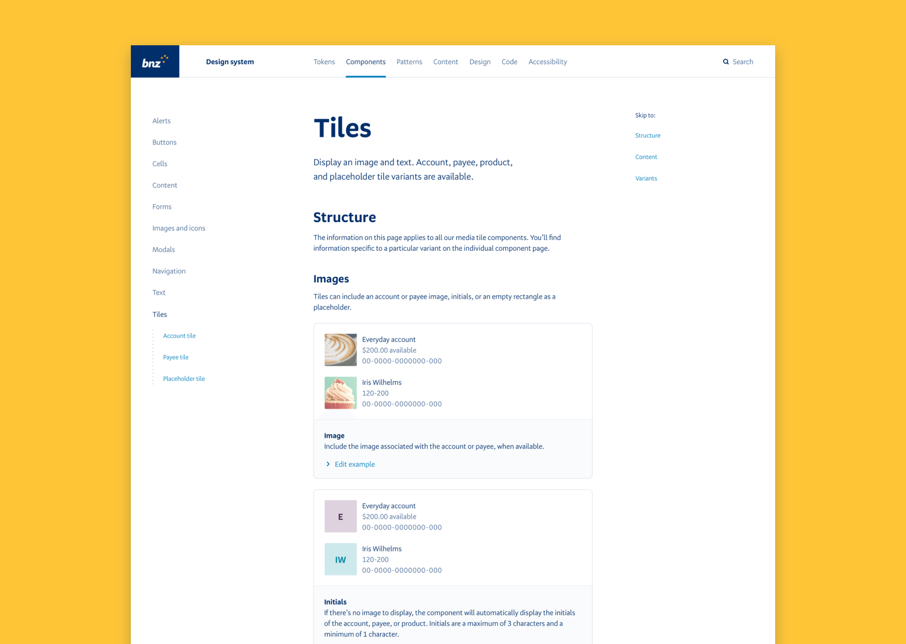
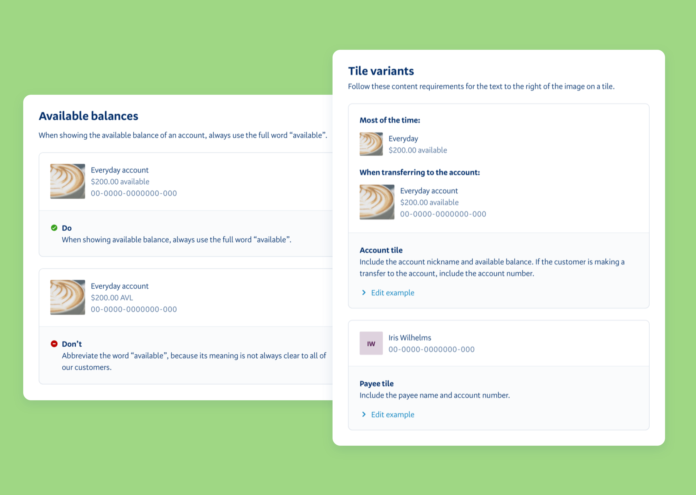
Documentation: Developer documentation of the design system was clear and up to date, but not much documentation existed to help designers and writers work with the design system. Developers were usually more familiar with the design system than designers or writers.
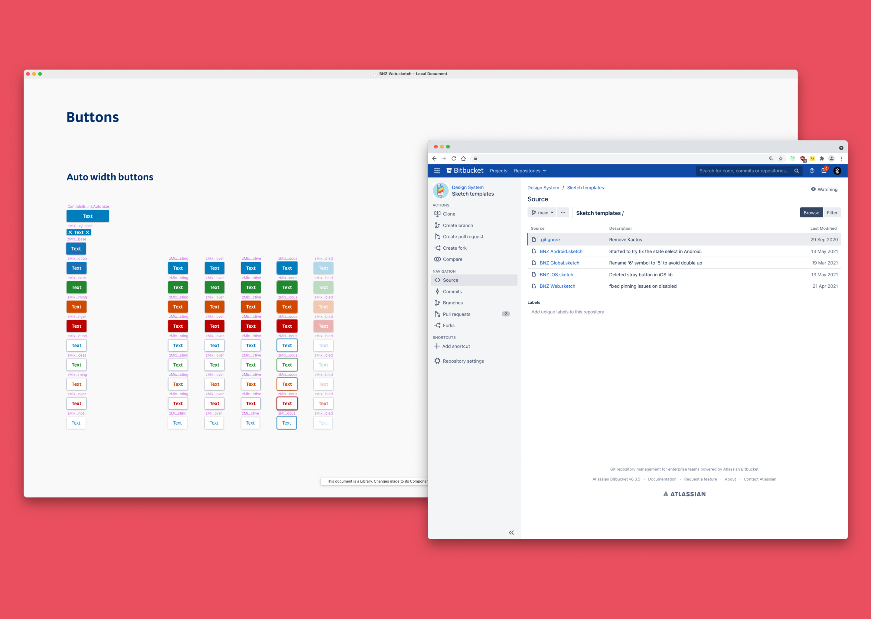
Tooling: Designers lacked a library to make use of the design system in their mockups and prototypes, leading to inconsistencies and longer development timeframes due to different specifications, for essentially the same component, multiplying over time.
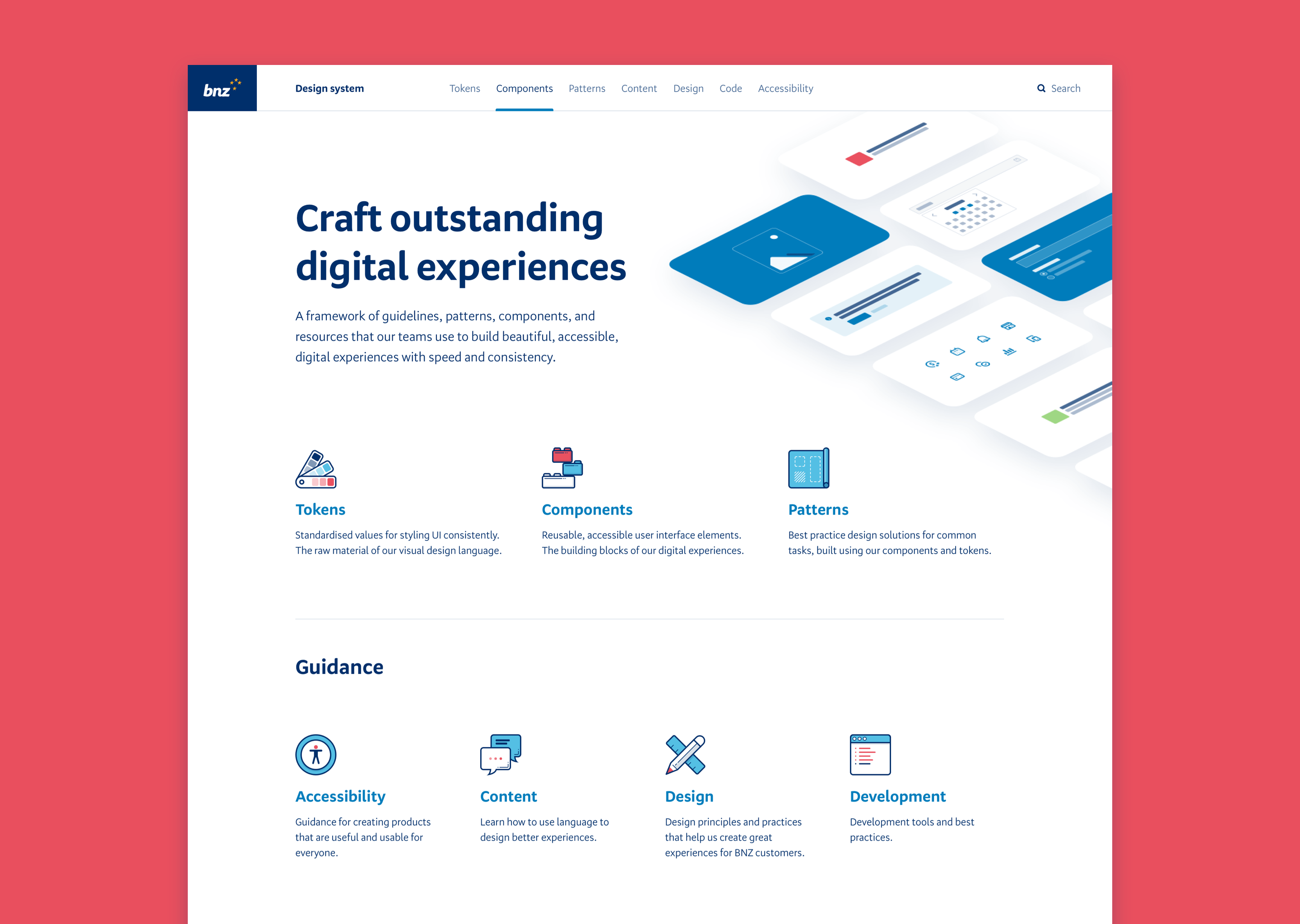
Maturity: The existing elements of the design system were sound, but it was missing a full suite of primitive and domain-specific components, design tokens, and a pattern library. That gave us a solid foundation to build on and a clear path forward to expand the system.
Community: Responsibility for maintaining the design system lay with a core web platform team, but we were missing out on contributions, adoption and feedback from the wider digital community within BNZ.
We began to set some goals for the design system that would help overcome the challenges, and take advantage of the opportunities, presented to us.
Adoption: Equip designers, developers and writers with the tools and documentation to help them properly take advantage of the design system.
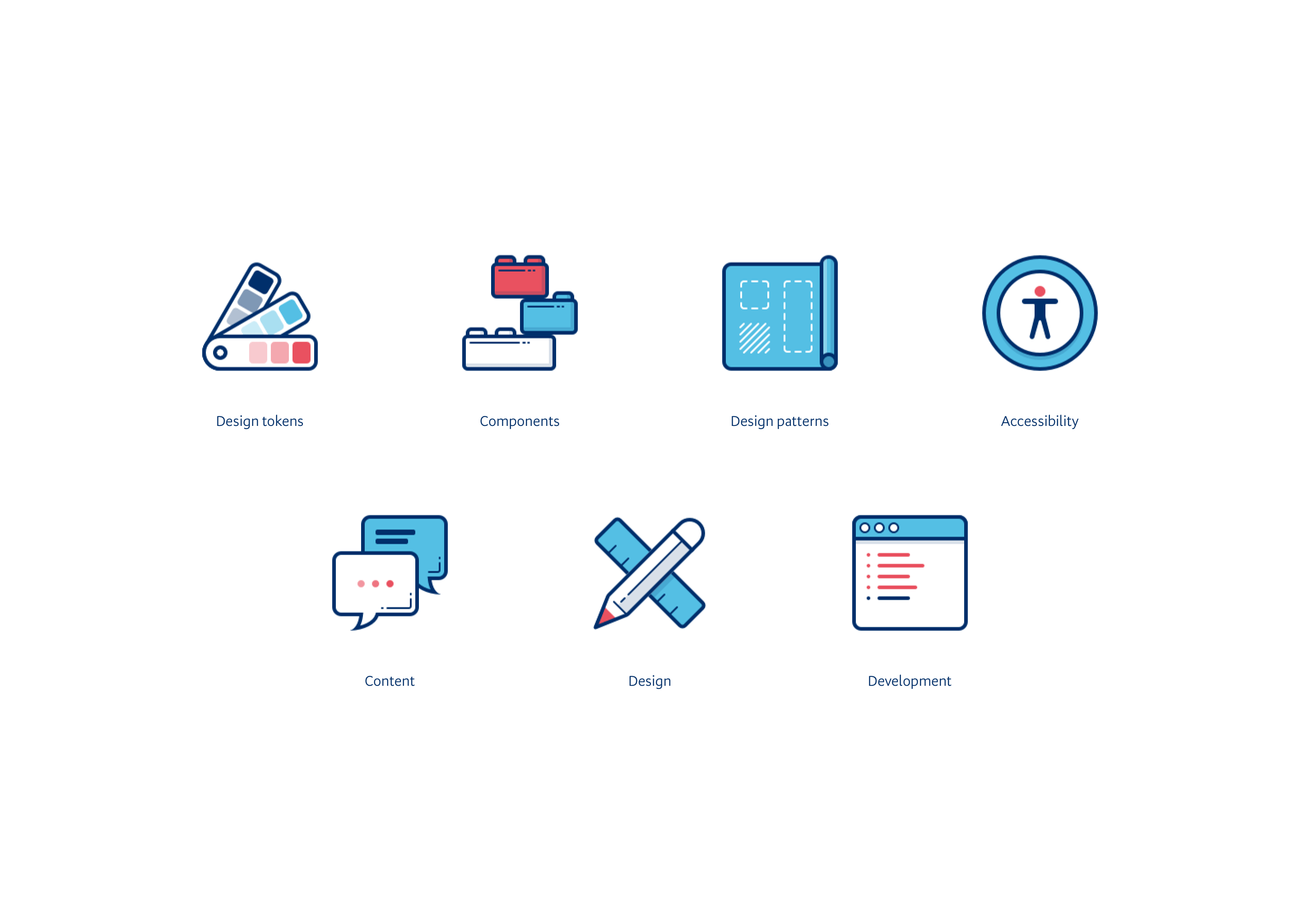
Expansion: Develop a mature, full-fledged system including design tokens, re-usable design patterns, and a full set of core primitive and domain-specific components.
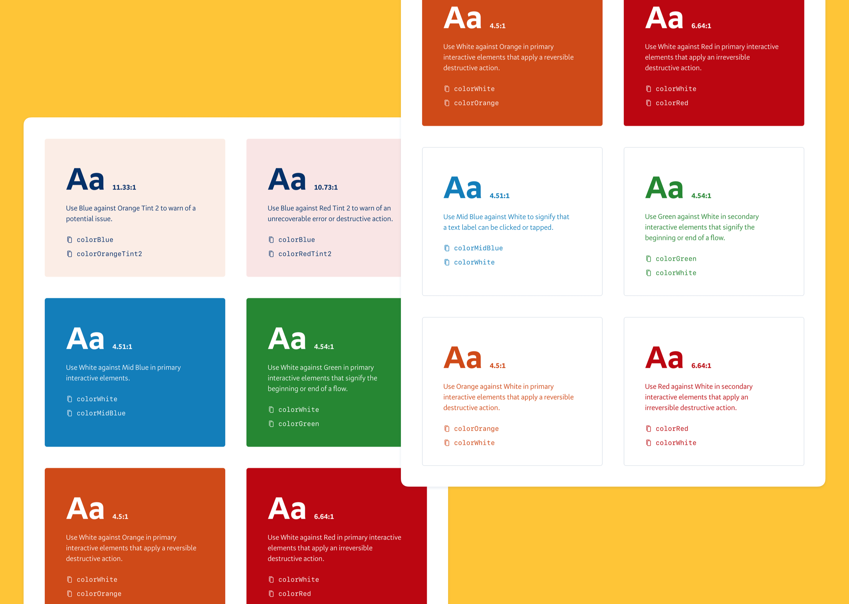
Accessibility: Make it easy for product teams to build accessible interfaces using the design system.
Collaboration: Promote a culture of contribution and collective ownership, by instilling a common vocabulary and understanding of the design system across product, design, content, and development people.
We did a lot of work, and had a lot of fun, in three years. Here’s a sampling:
Consultation: We shared mockups and preview builds with the teams who would eventually make use of each new design system component or pattern. By consulting widely we promoted a sense of shared ownership and ensured a straightforward rollout and adoption of new design system elements.
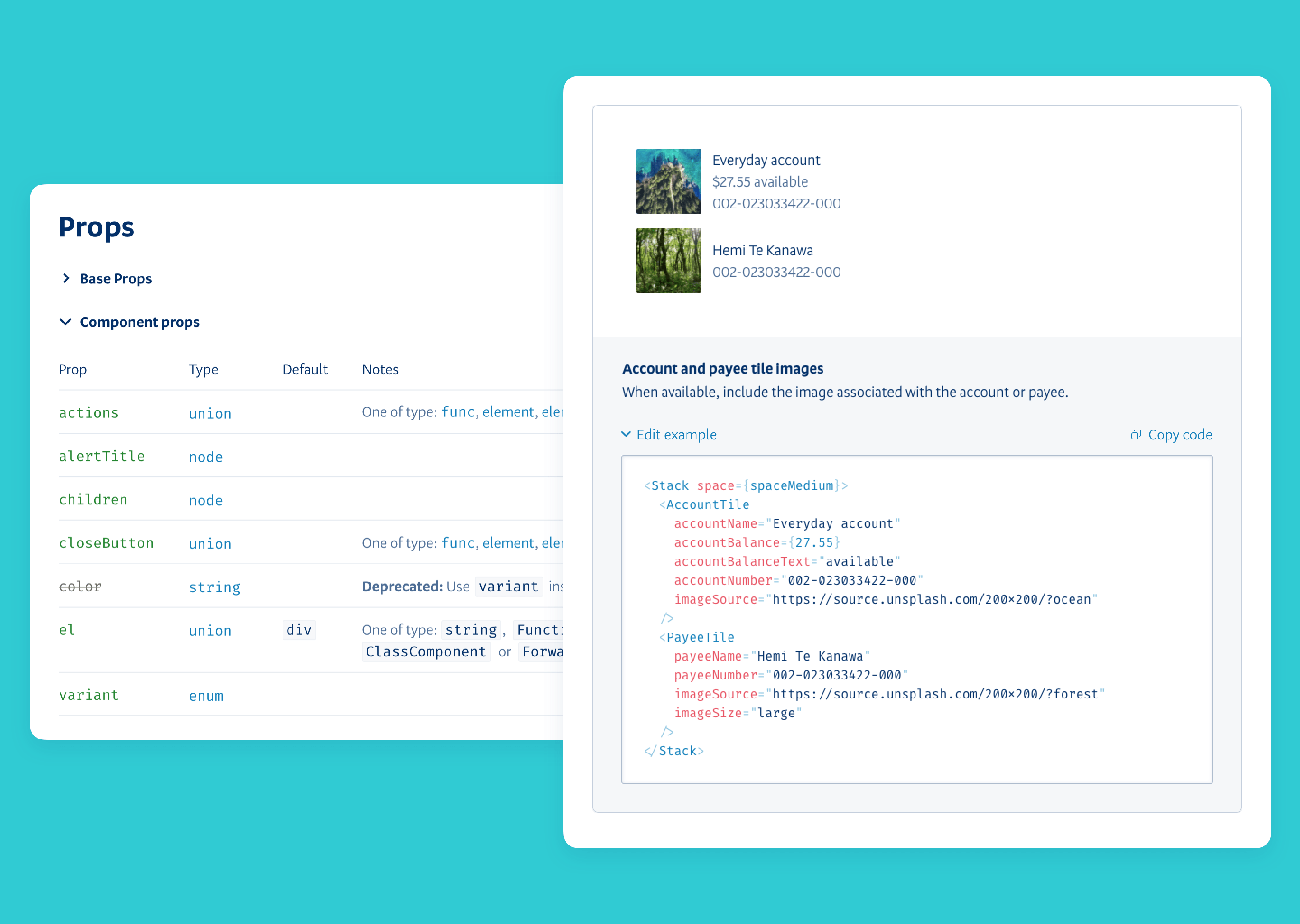
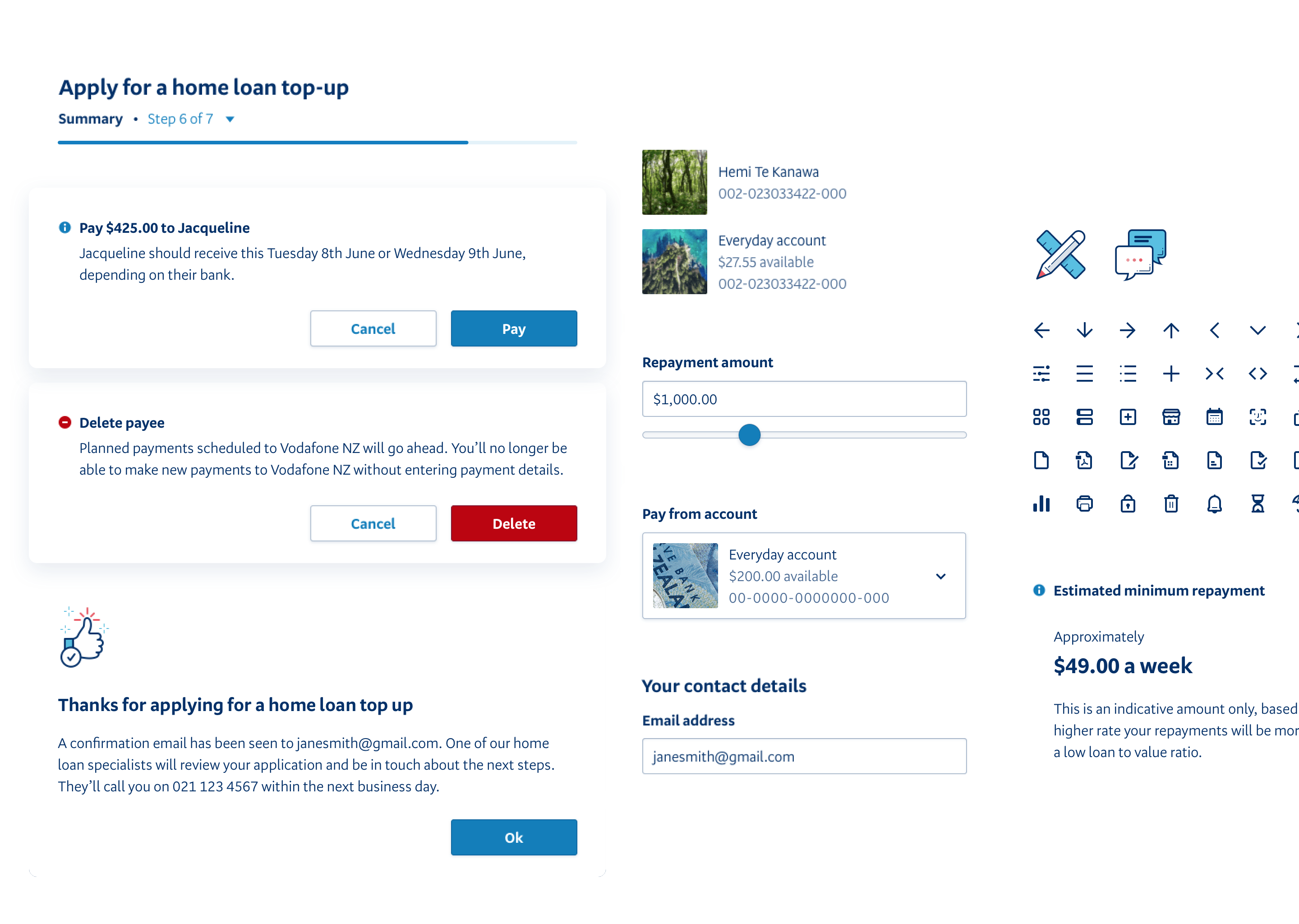
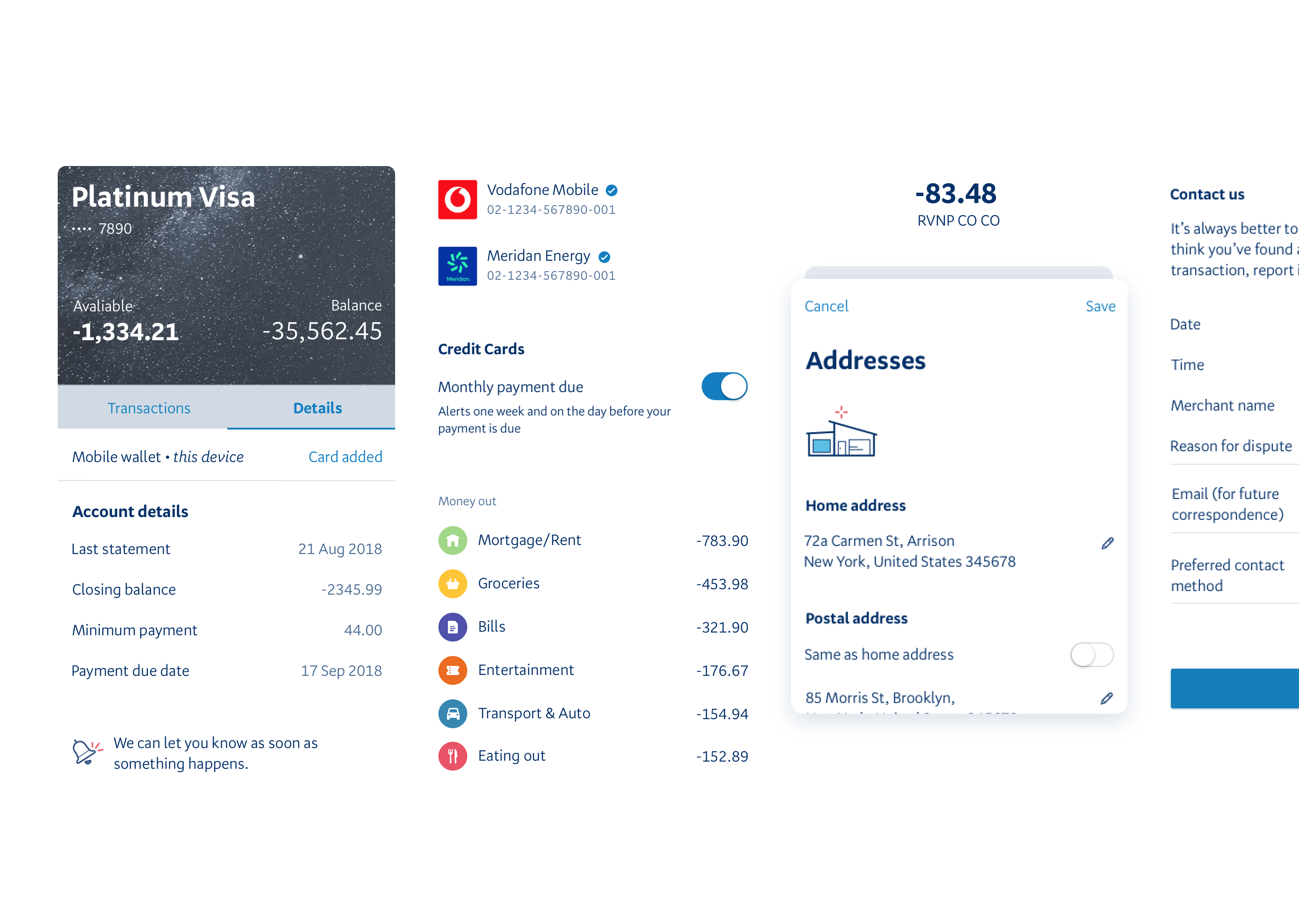
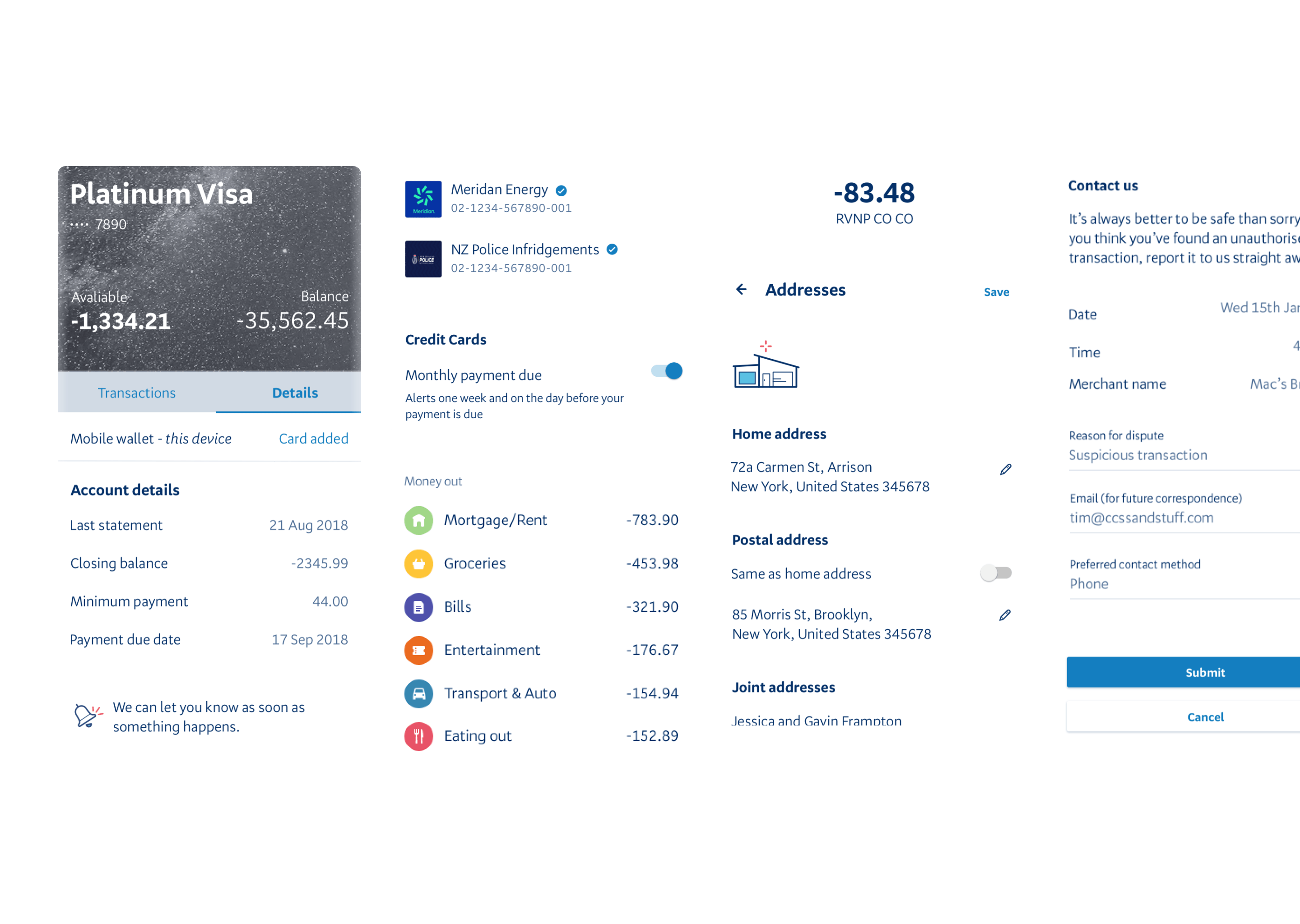
Comprehensive component set: A mix of core UI primitives and domain-specific components like account tiles or payee pickers.
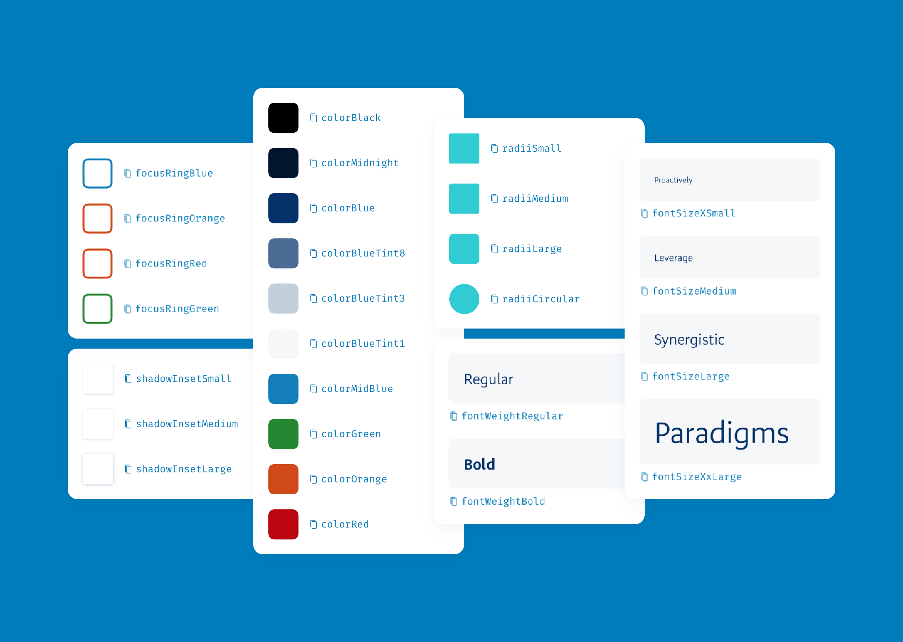
Design tokens: We shipped design tokens, the most fundamental building blocks of the system, as an installable package and made them available to all developers at the bank.
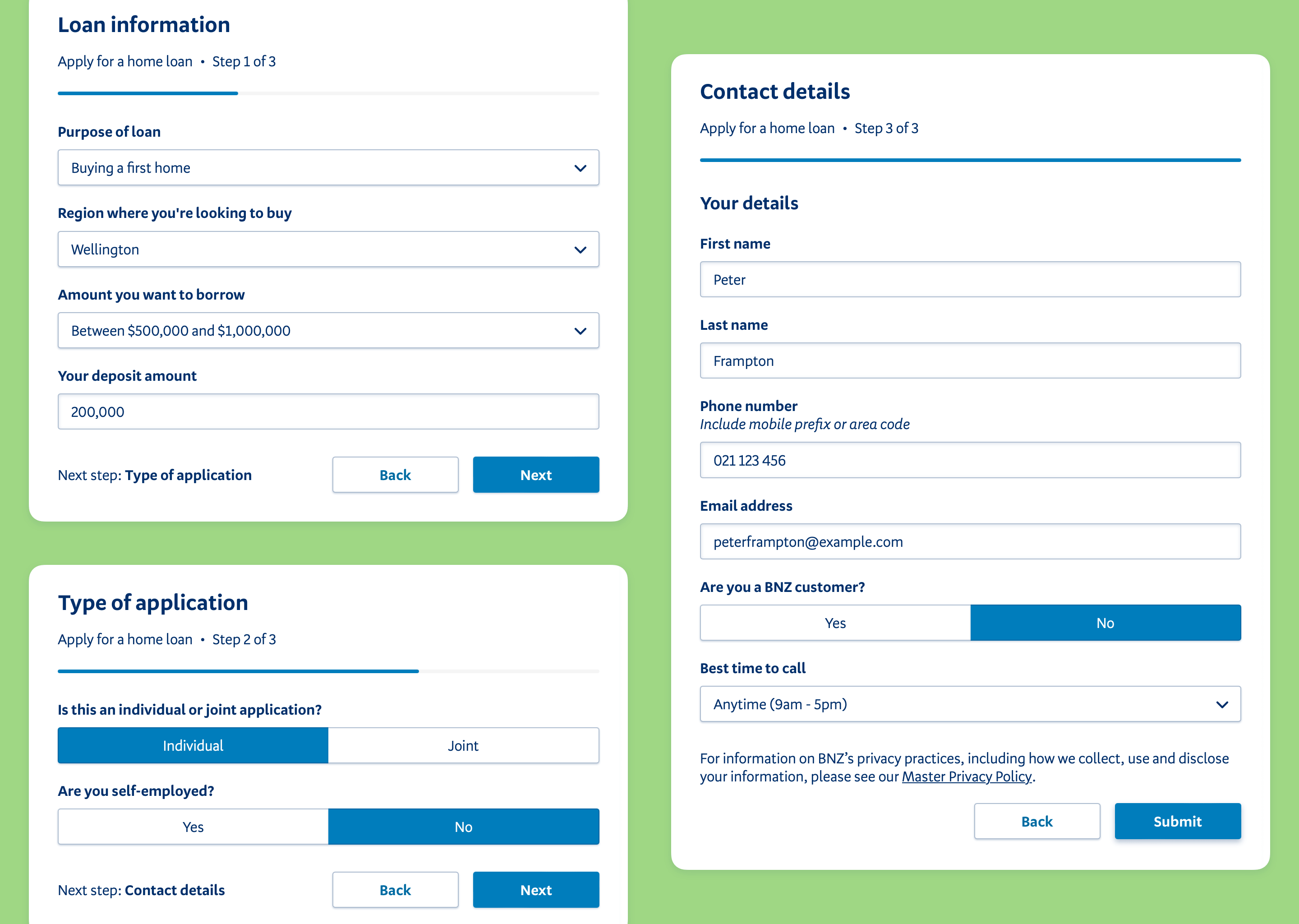
Design patterns: We began a programme of work to design, build and document re-usable design patterns. One such example is the multi-step form pattern, which over time, had been implemented multiple different ways in different projects. Each new design pattern reduced design and development lead times for product features that made use of it.
Documentation: We overhauled the design system documentation, adding guidance on component usage for designers and writers, and pre-configured editable examples and prop dictionaries for developers.
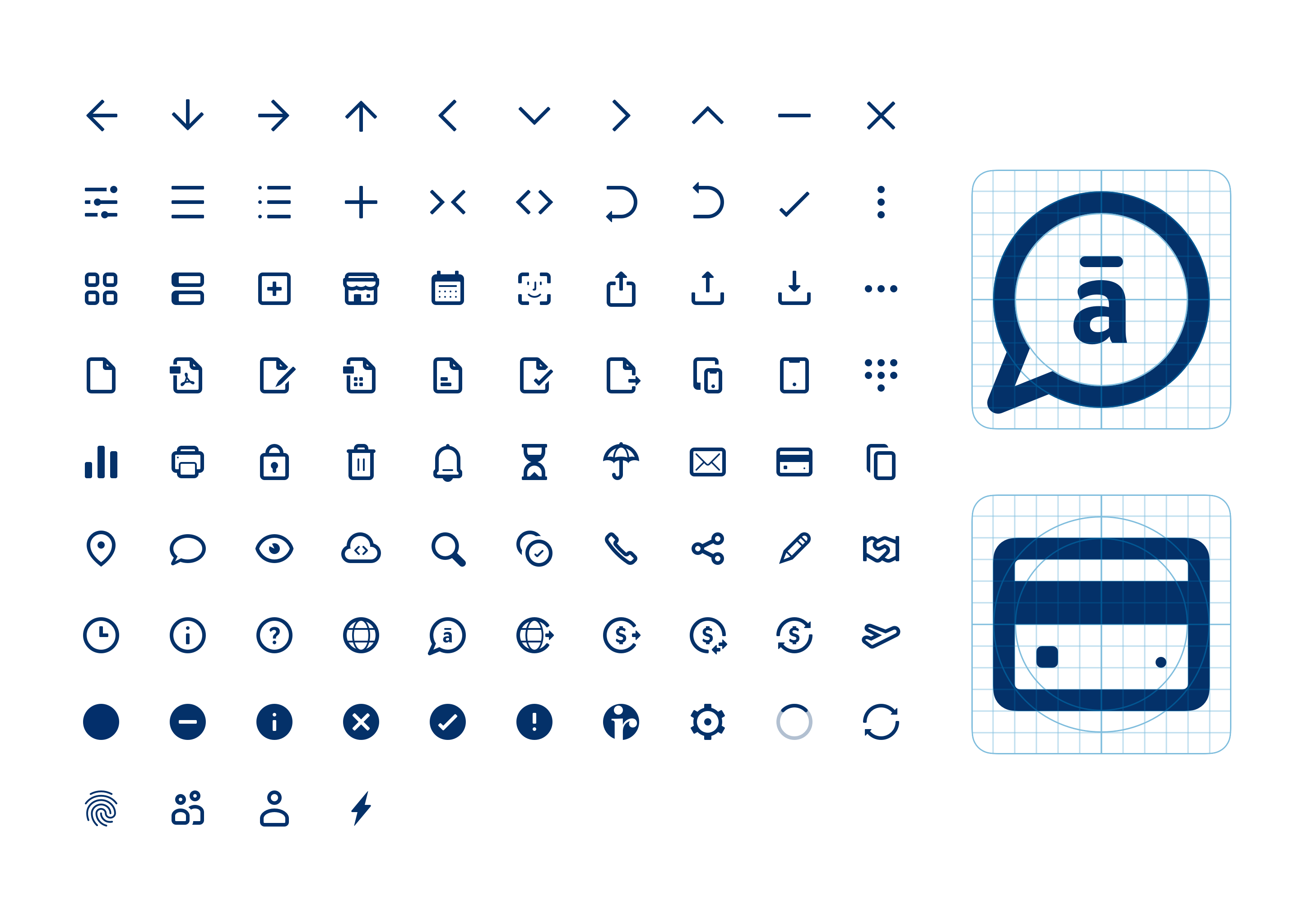
Icons and illustrations: We developed a comprehensive suite of bespoke icons created with a consistent style and proportions, and published them to the Sketch and React toolkits.
It only took us two weeks to spin up a proof of concept using design system components. I’d guess it saved us at least 2-3 months.
When the documentation site was launched, we received positive feedback and comments. People saw it as an essential source of truth for design, content, and code standards; and most importantly, a time-saver.
Designers felt that having the components pre-built and configurable for them saved them significant amounts of time and deliberation over small decisions, allowing them to focus on the bigger picture of the experience they were creating.
We received frequent pull request contributions to the Sketch library repository from designers adding more elements from the design system, allowing us to build up a full suite of ready-made components for mockups and prototypes, and improving handover to developers.
Pull requests from around the bank into the design system began to roll in, as a result of better community engagement and awareness.
Over time, since Q4 2021, the team have gathered some statistics about the impact of the design system: