I collaborated with fully remote, internationally distributed teams across multiple time zones to design, build, and roll out a design system for Stedi, a B2B SaaS company focused on making it simple for people to build EDI integrations.
Stedi is staffed by internationally distributed product teams, each responsible for their own product area. I was a designer and front end developer in Stedi’s web platform team. Most of our team were based in New Zealand and Australia, and we were responsible for maintaining the core front end infrastructure and design language used by every other team.
As a designer and developer, I collaborated with business people, designers, and developers in teams around the world to identify and prioritise opportunities to improve quality and efficiency with a design system, then executed responses to those opportunities.
When started at Stedi, they had the some elements of a design system in place. There were some components, a colour palette, and some design tokens. I spent some time working with the web platform team, designers, and developers around the company, to figure out how I could help.
I began by auditing Stedi’s user interfaces — in terms of the design, the code, and how they worked — to find opportunities to improve efficiency, accessibility and design cohesion. The audit helped us plan an initial roadmap for the design system work:
To help the design team out, and familiarise myself with everything in detail, I created and maintained a Figma library of design tokens and components. The library mirrored exactly what existed in production, and I published it as a reference for designers. As we worked in code I kept the Figma library up to date with what we had done. The Figma library made it easier for designers to create mockups and prototypes using existing design system elements, and as a consequence reduced the number of unnecessary new components built by developers.
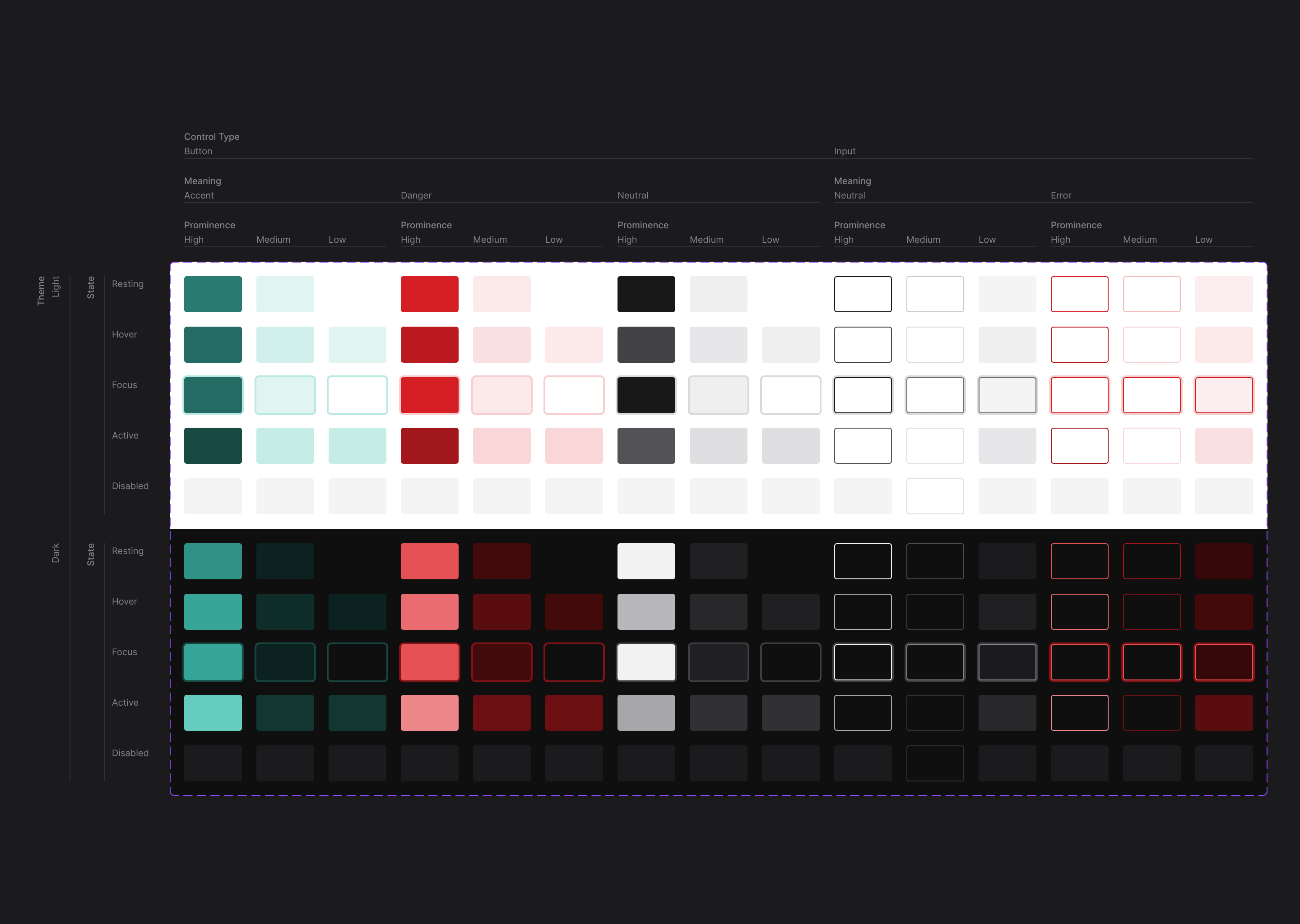
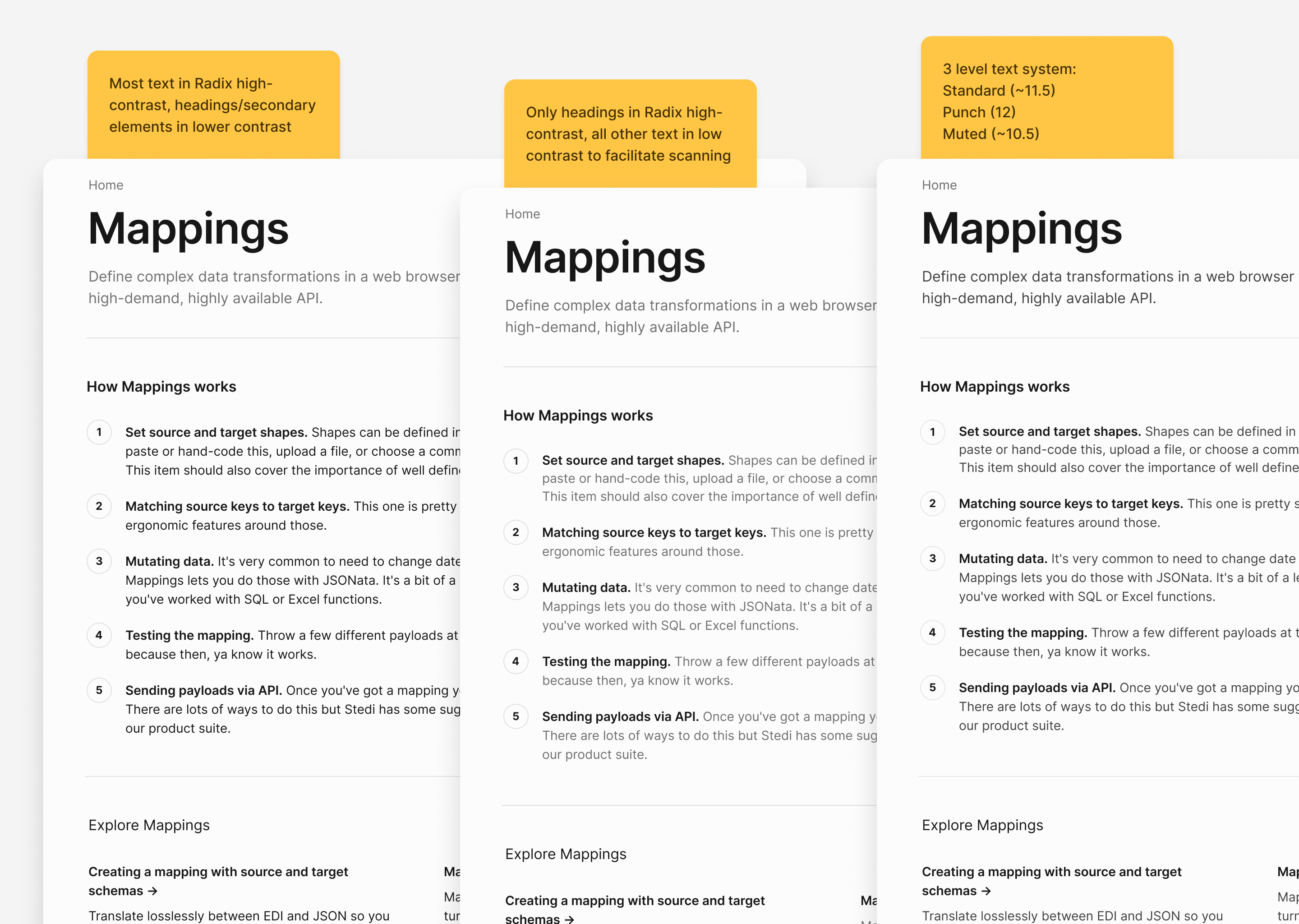
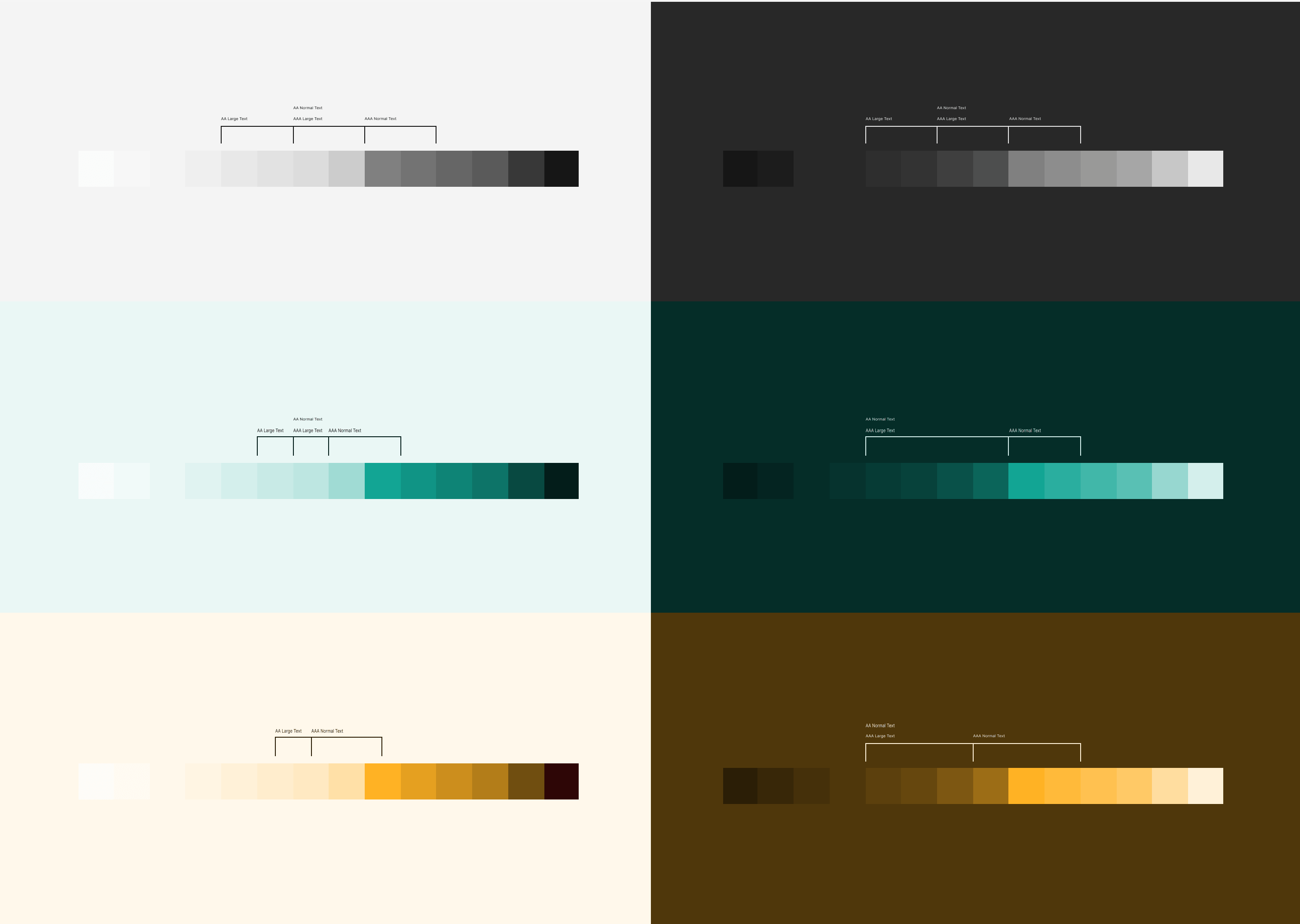
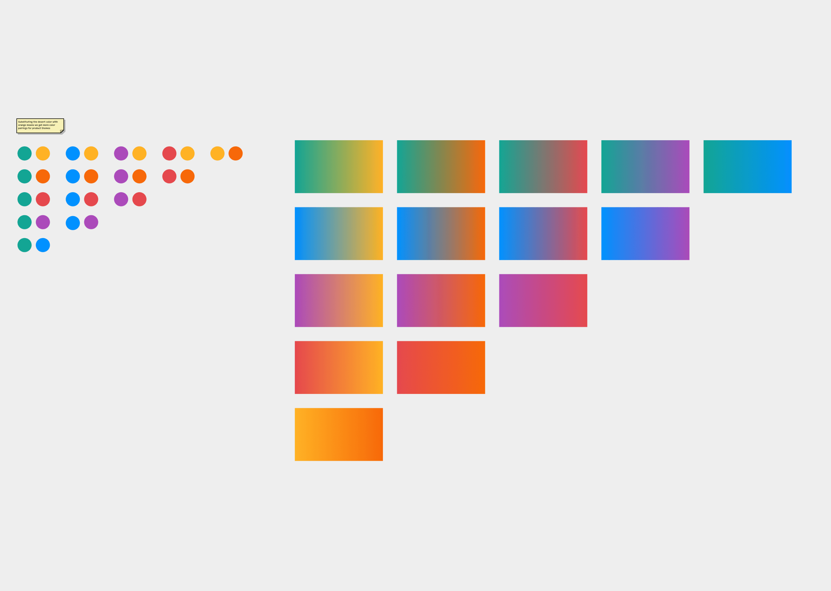
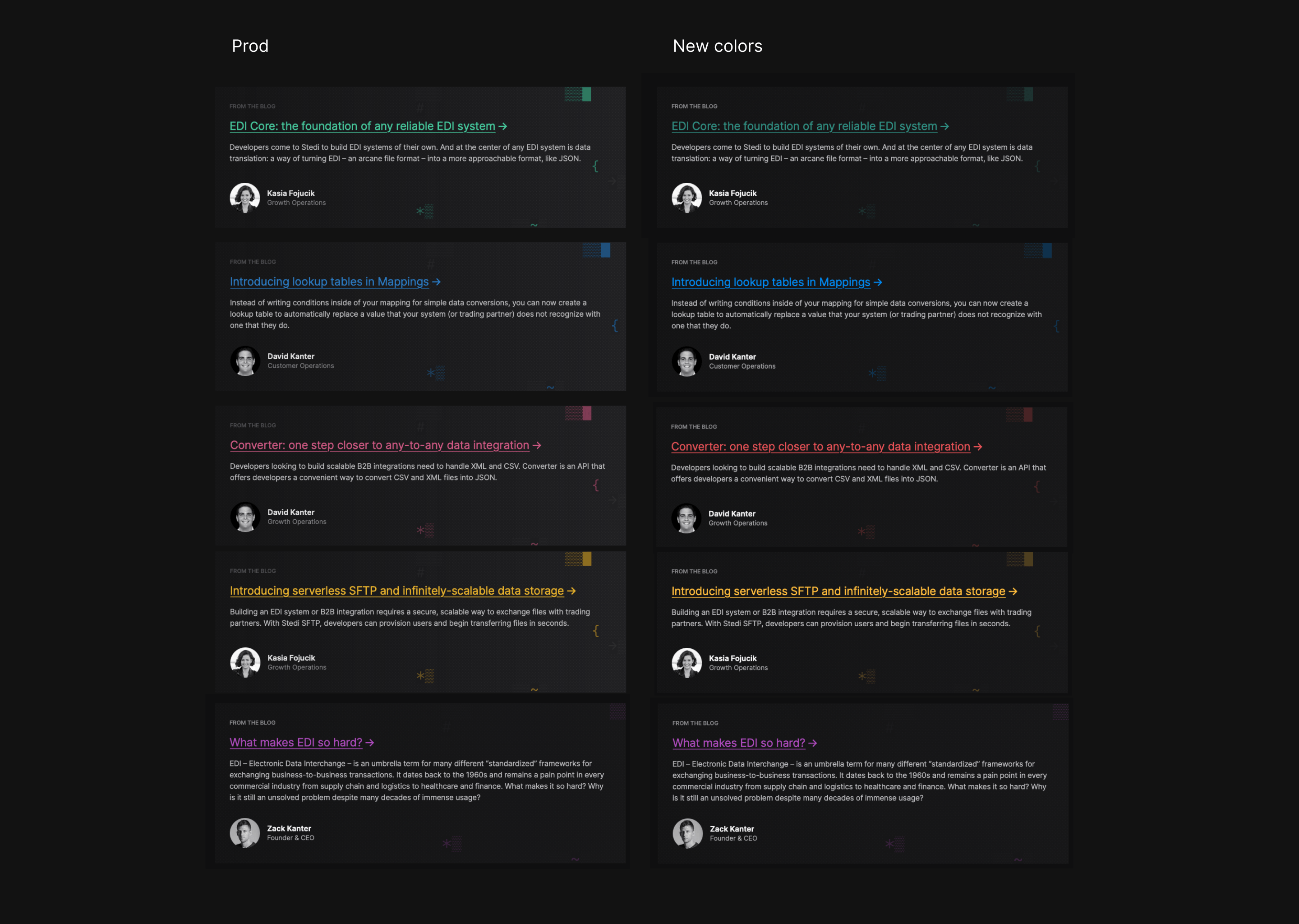
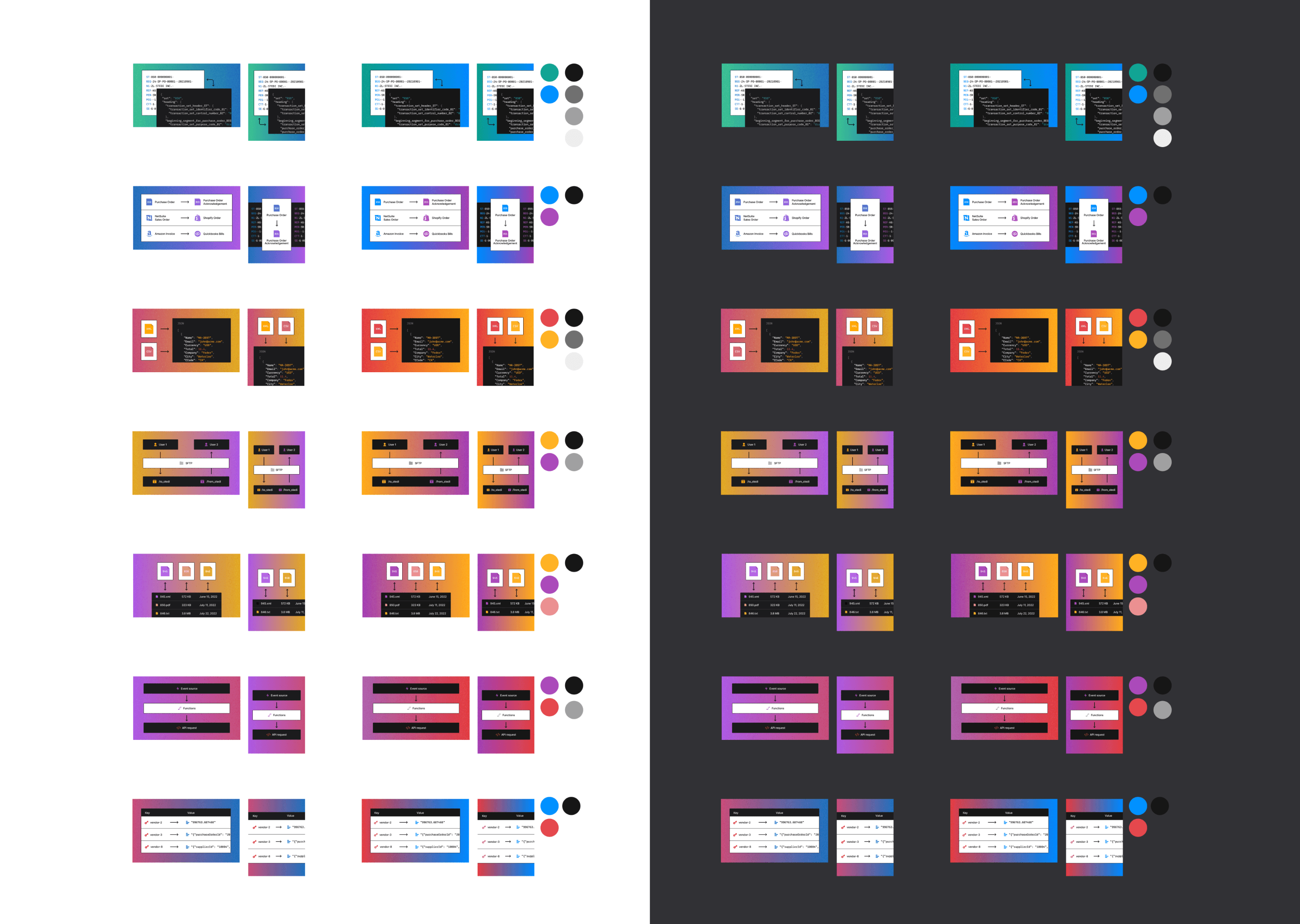
There were a few colour tokens in the design system. They weren’t documentated, and the palette wasn’t really extensive enough for the types of user interface people were producing. The audit showed that as a result of this, colours were applied inconsistently and didn’t always meet WCAG (or APCA) guidelines for contrast.
My first impulse was to reach for Radix Colors. It was ready to use, it would work our front end stack (Radix UI and Emotion) and matched Stedi’s existing brand and semantic colours surprisingly closely. After some experimentation we modified Radix Colors to suit Stedi’s particular needs, adding an third specific shade for text, and slightly darkened hover and pressed states for solid colours.
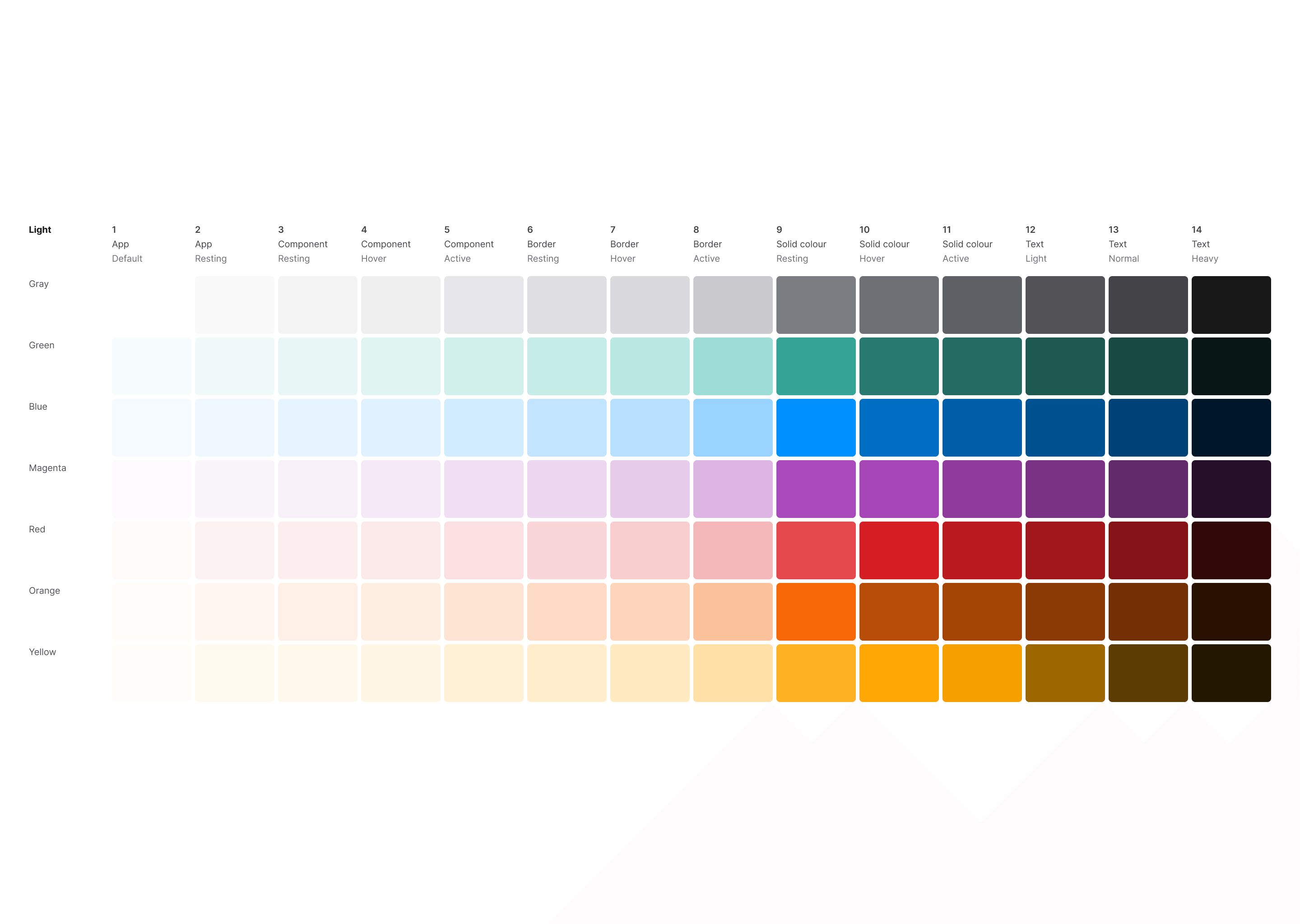
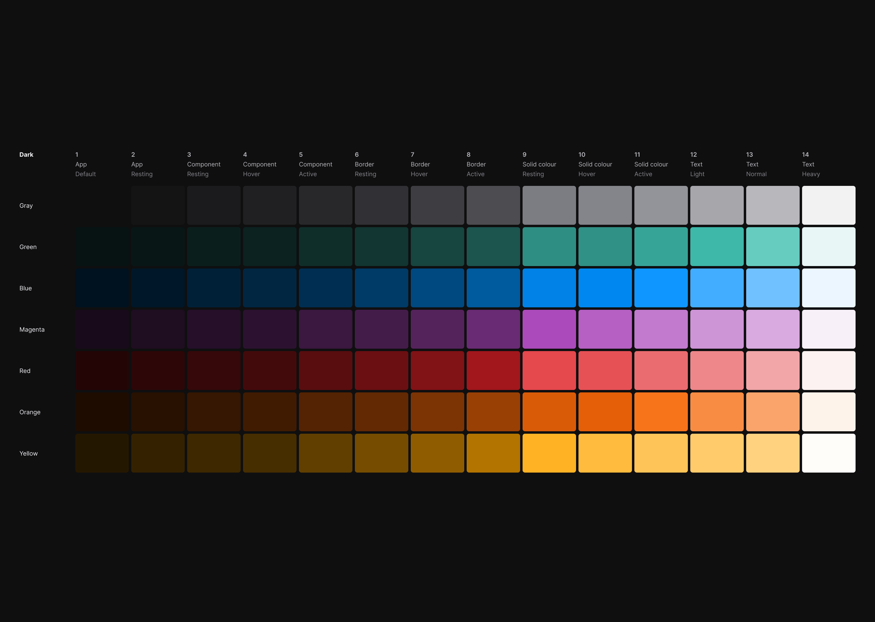
The colour palette covered neutral, semantic, and brand colours and included guaranteed accessible colour cominations. I published it in a Figma library for the design team, implemented it in code, and published Storybook documentation. Once the code was released I created a series of pull requests implementing the colour palette in each of Stedi’s products.
We improved accessibility and design cohesion, and saved everybody time, by providing designers and developers with a ready-made colour palette and a lightweight guide for its use. The project took about three weeks, virtually eliminated Lighthouse colour contrast errors everywhere, and greatly reduced the workload involved in the creation of subsequent components and products.
The existing design tokens were not always used by designers or developers because they were not documented or available directly in Figma, and did not always match design requirements. By refining and expanding the existing design tokens, publishing them in both Figma and code, and documenting them, we lifted user interface quality and coherence, and helped designers and developers to move faster together.
We all liked the way Radix UI worked and chose to use it to power the internals of the Stedi design system when possible. It made sense for us to use a trusted library to avoid writing boilerplate or grappling with already-solved problems around interactivity and accessibility. Where we used it, we wrapped a Radix UI component in our own API, leaving room to easily swap the Radix UI internals out for something else later without causing disturbance to other teams. This approach saved us a lot of time and ensured the things we built worked well with different input methods like keyboard input and screen readers.
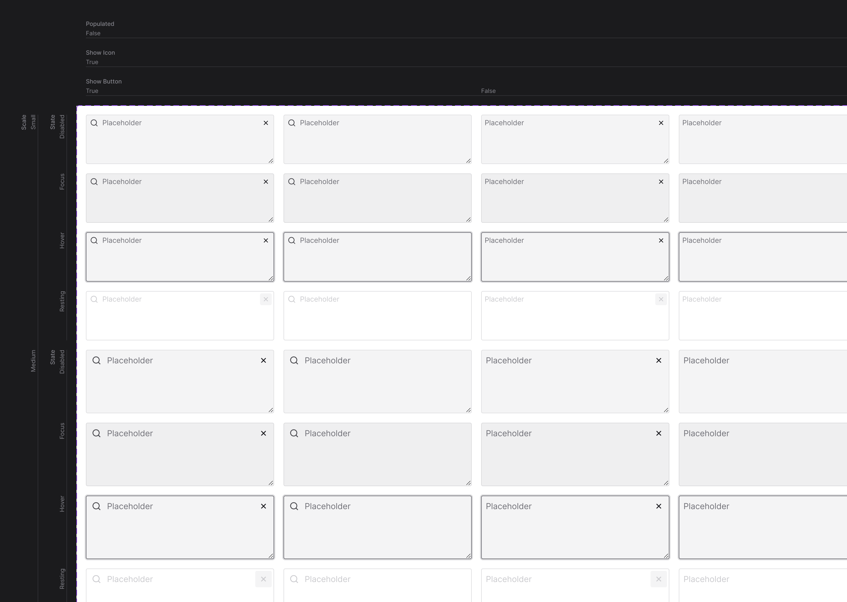
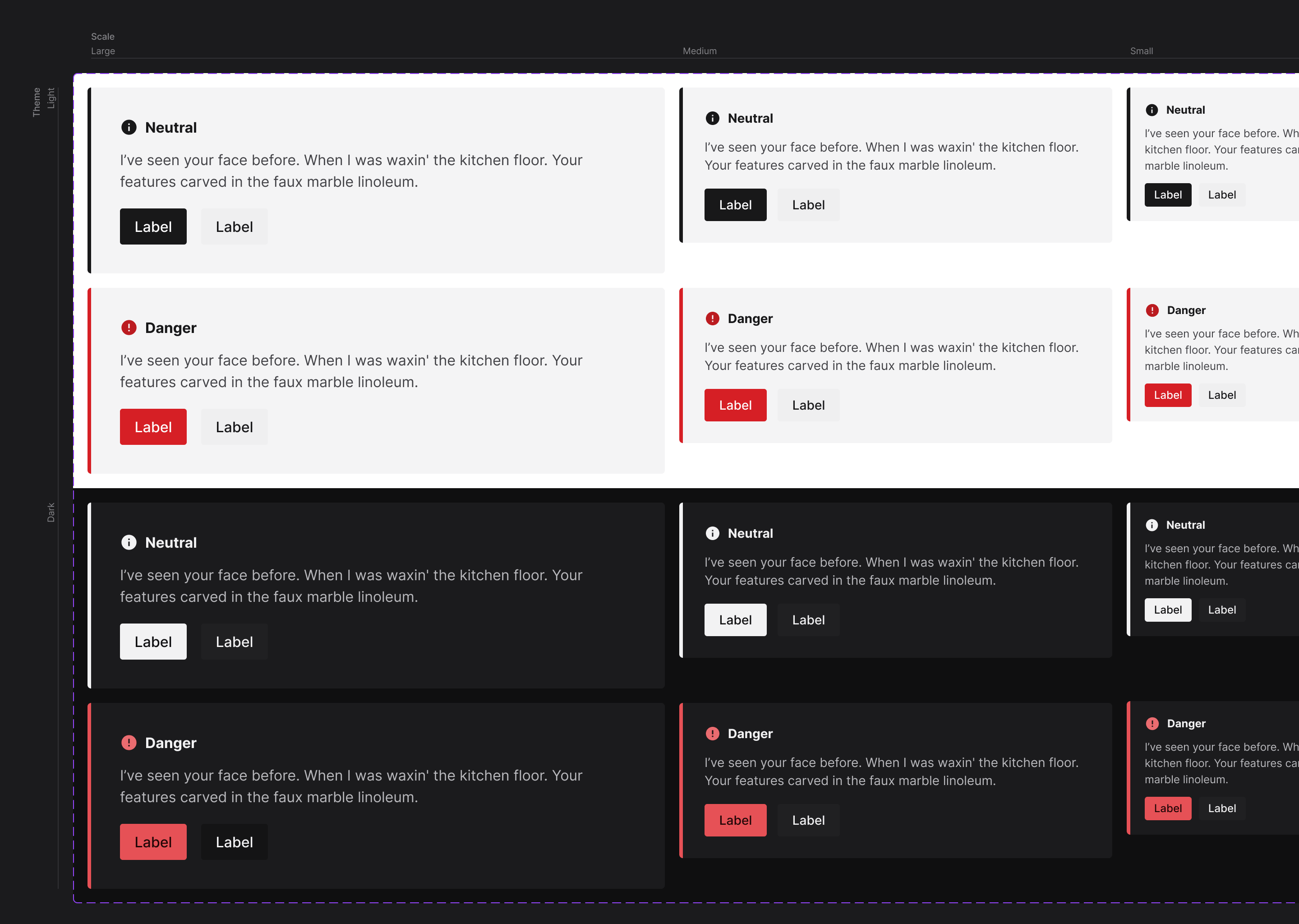
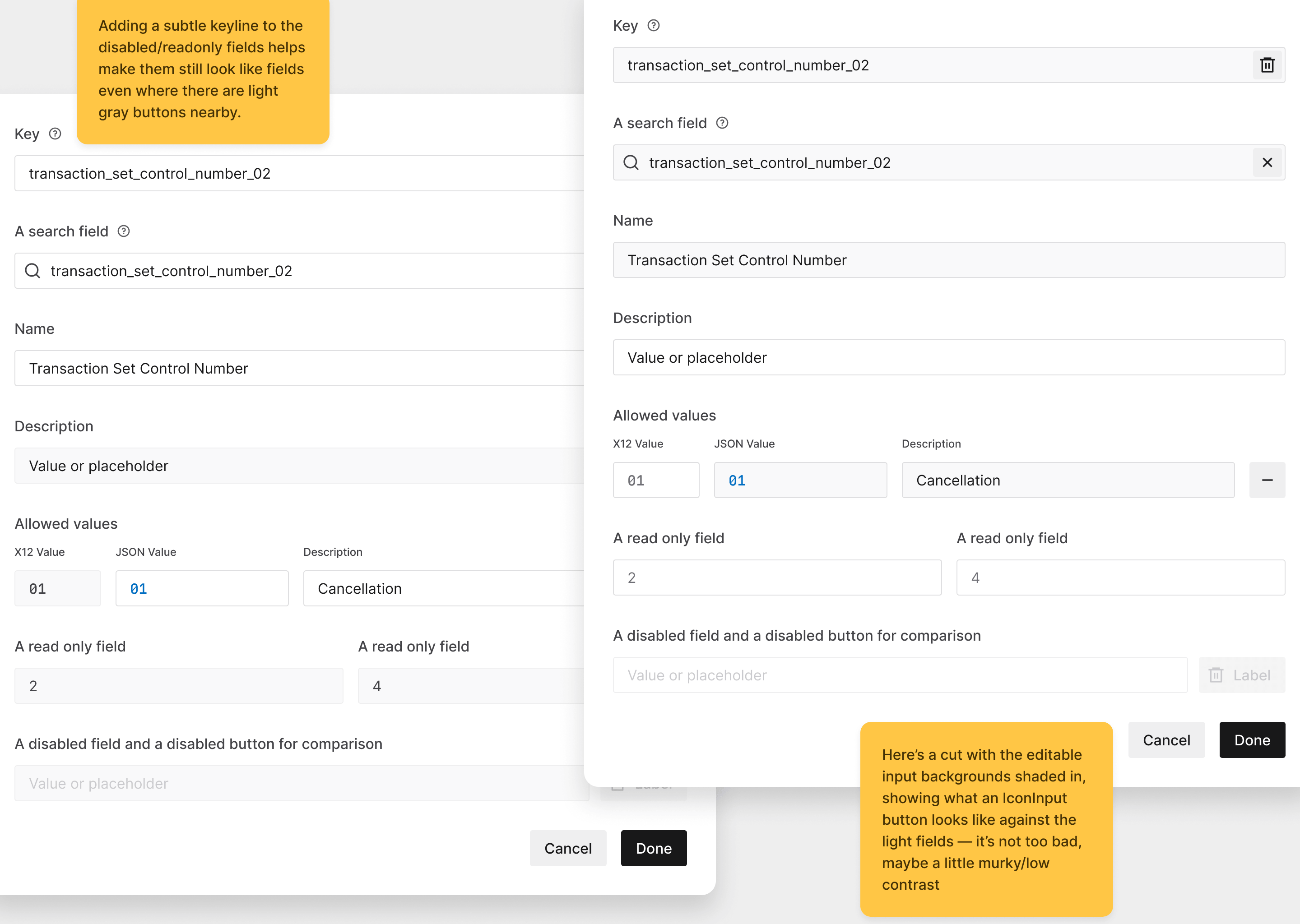
The audit showed that not all components included hover, active, focus, disabled, or read-only states. Those are easily missed, but for such a small detail, they are so important for the usability of the entire product. There was opportunity to improve the usability and accessibility of all of the company’s products by providing these affordances in core design system components.
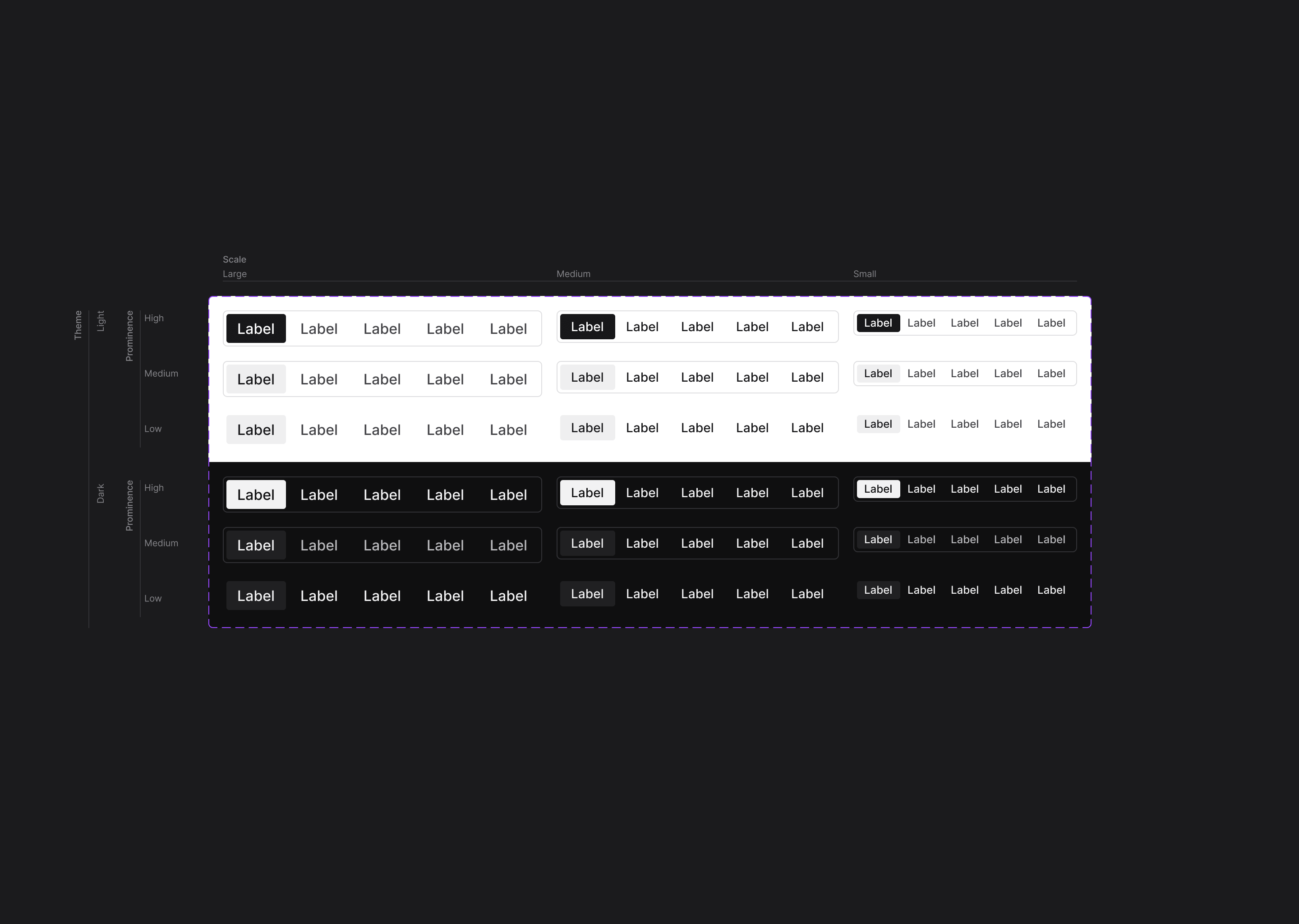
Making use of the new colour palette, I designed and modelled re-usable state styles for broad categories of interactive components like inputs, buttons or selects. Each style included resting, hover, active, focused and disabled states (along with read-only states for text inputs). Once they were working well I documented them, published them in the Figma library, and merged them to the production design system. This foundational work paid dividends because it improved the accessibility and visual cohesion of Stedi’s products without any work from product teams, and we were later able to re-use those styles in the design and production of more new components.
Developers in product teams often broke through component abstractions to make customisations (or select elements in unit tests). That approach, while it was pragmatic, made releasing design system updates somewhat fraught. It was difficult to predict how consuming code was reaching past a component’s API to select and modify internal elements, so each update of the design system dependency was a time-consuming process of trial and error.
We could reduce CI usage and failures, and save everybody a lot of work, if we could work out how to eliminate the need for such extensive customisation of the design system.
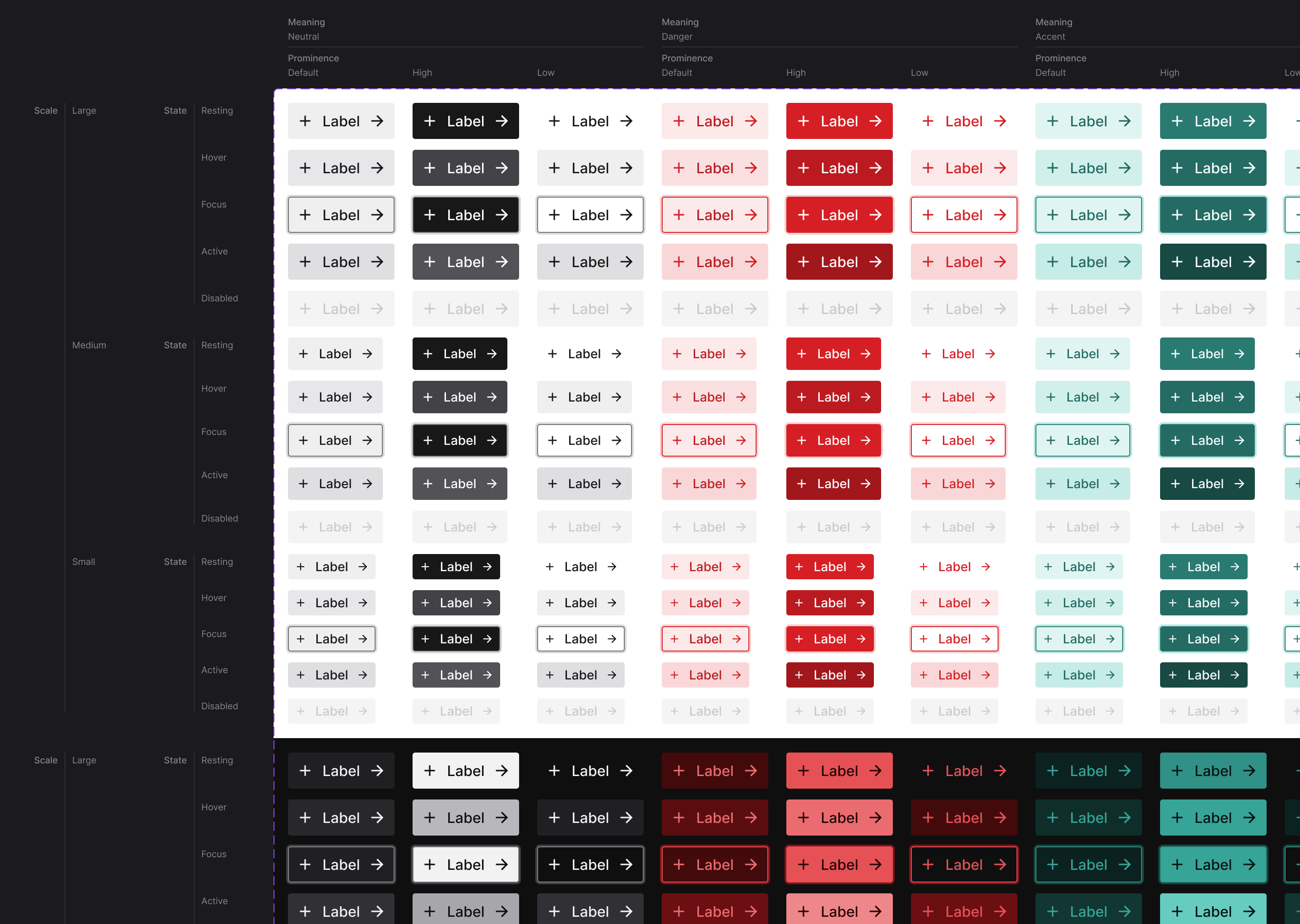
The audit had shown us that in almost all cases, people who broke through component abstractions to make customisations did so to make things bigger or smaller, increase or decrease visual contrast, or add semantic meaning (for instance, making a button that performs a destructive action when clicked, red). I designed variations in size, prominence and semantic meaning for each affected design system component, then implemented them in code as component props.
| Prop | Type | Default |
|---|---|---|
meaning | "neutral" | "primary" | "danger" | "neutral" |
prominence | "low" | "medium" | "high" | "medium" |
scale | "small" | "medium" | "large" | "medium" |
Over a week or two I worked through half a dozen product repositories and replaced customised components with the new prop configurations. As well as improving design consistency, that work made the entire front end more concise and robust, reduced every team’s maintenance overhead, and made future design system updates less risky.
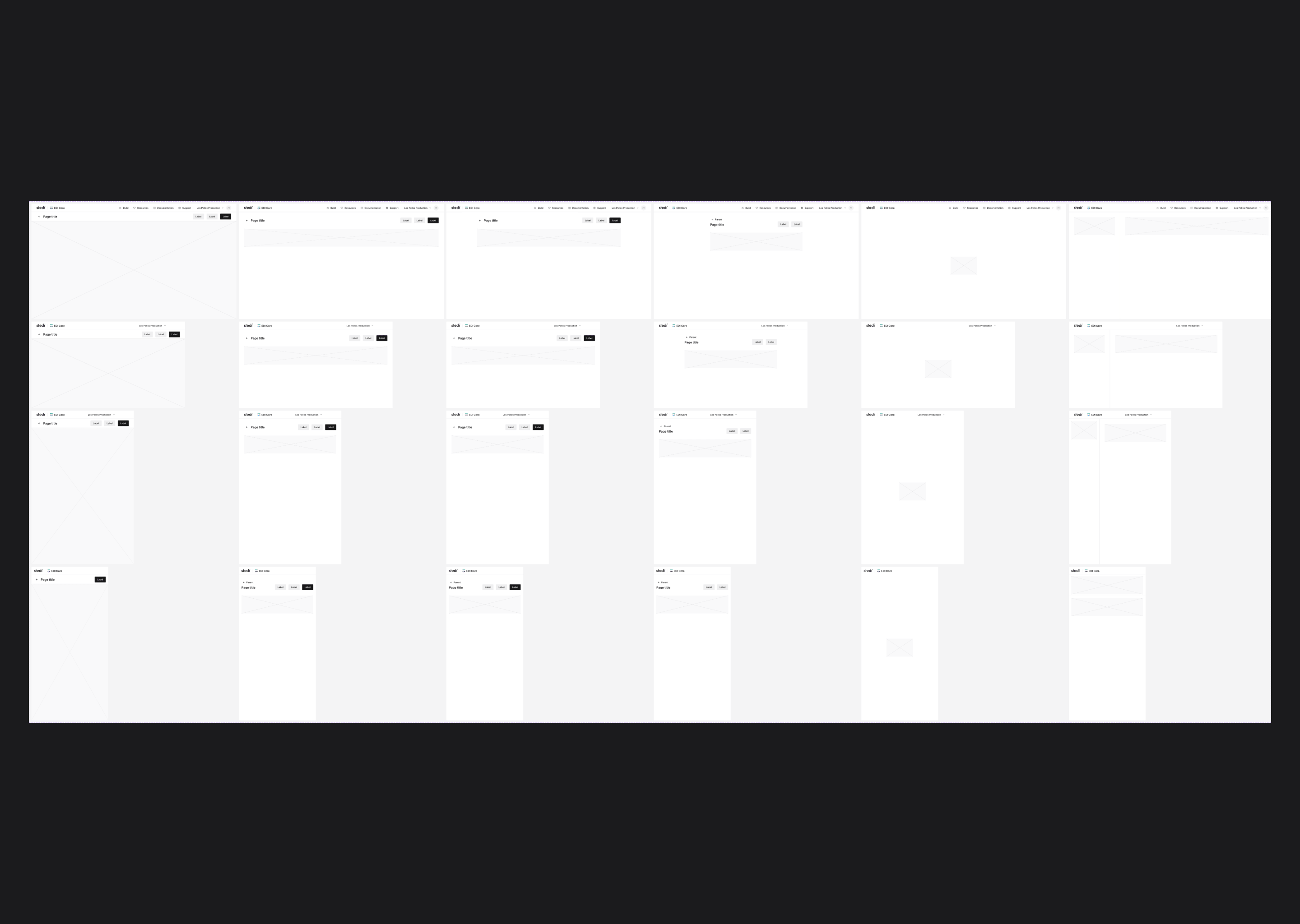
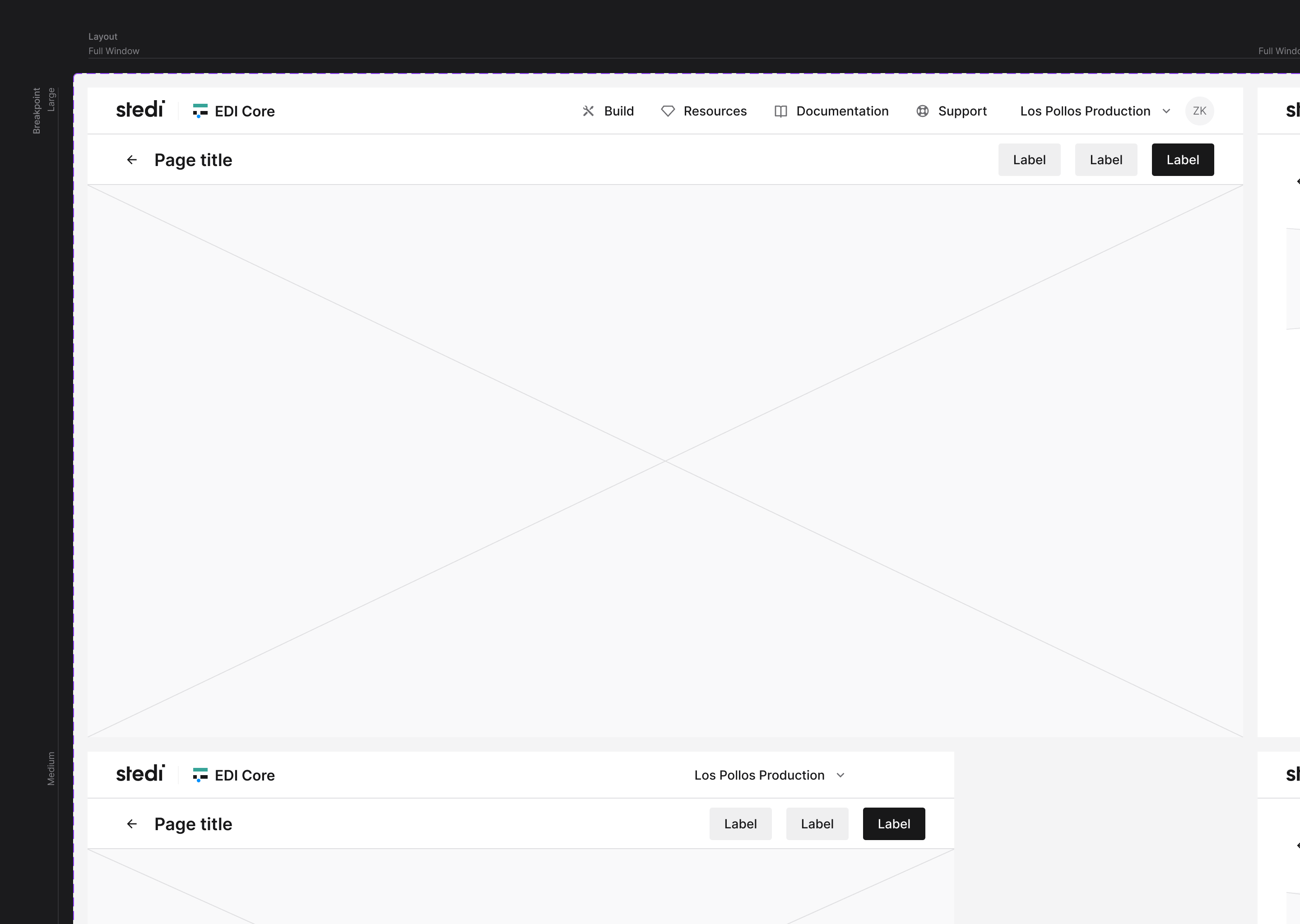
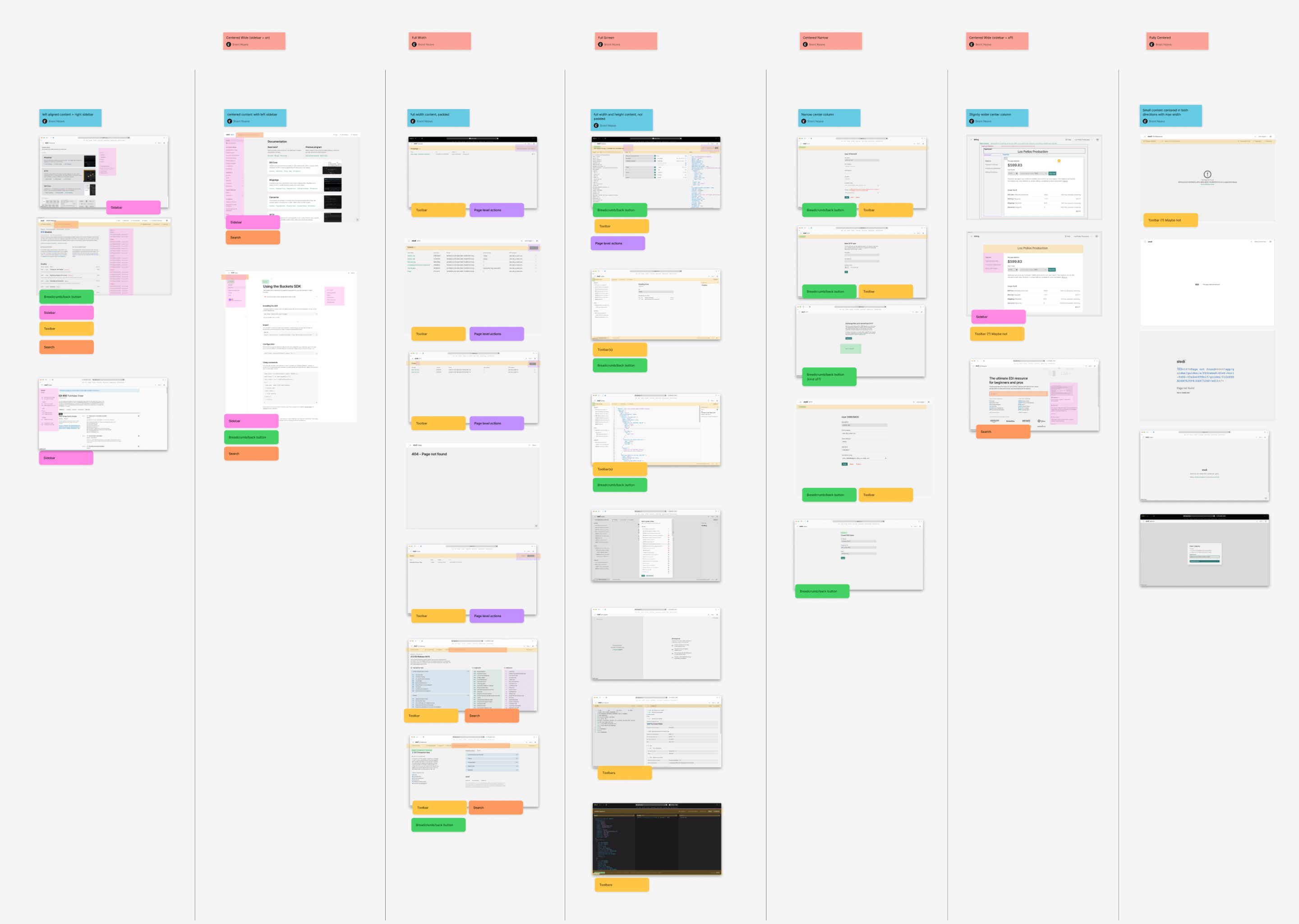
Each team independently implemented layouts for each new product area or view they created. It was code that needed to exist, but repeating it across multiple teams was redundant, took time, led to inconsistent appearance and behaviour, and increased the surface area for possible bugs. We decided that we could reduce the amount of boilerplate produced by product teams and create a more consistent user experience by providing a set of core layout components.
During the audit we grouped screenshots of every product view into one of six categories of layout. Within each category, each view was fairly similar but there was arbitrary variation in scrolling behaviour, background colour, navigation and toolbar placement, and how content was laid out.
With a view to saving people from laborious work, bugs, and dreaded inconsistency, we designed and built a View component with configurable scrolling behaviour, content/interface placement, standardised space for main navigation and toolbar components. By doing so we were able to remove a lot of repetitive, arbitrarily different user interface code and ensured consistent layout across every product view.
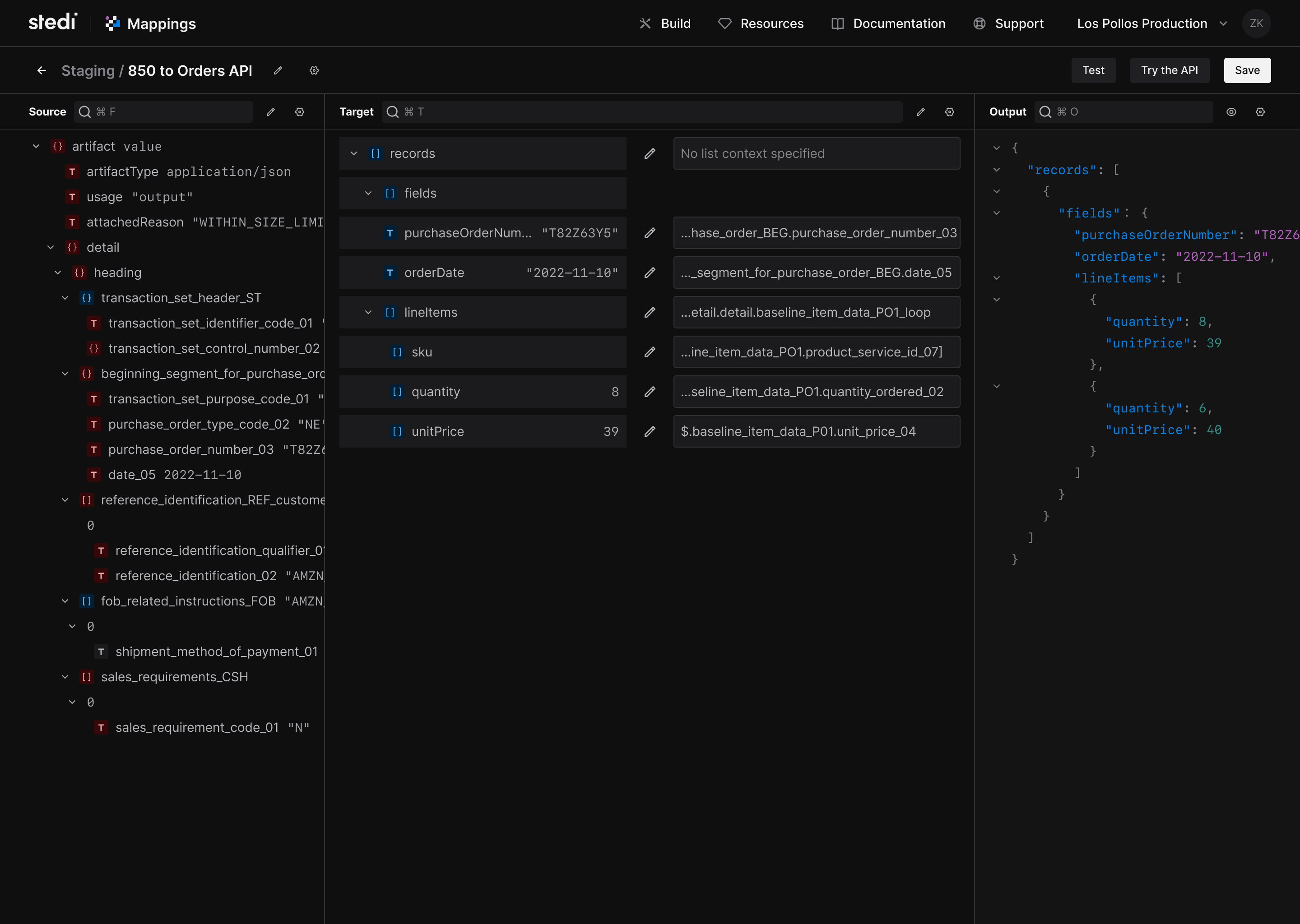
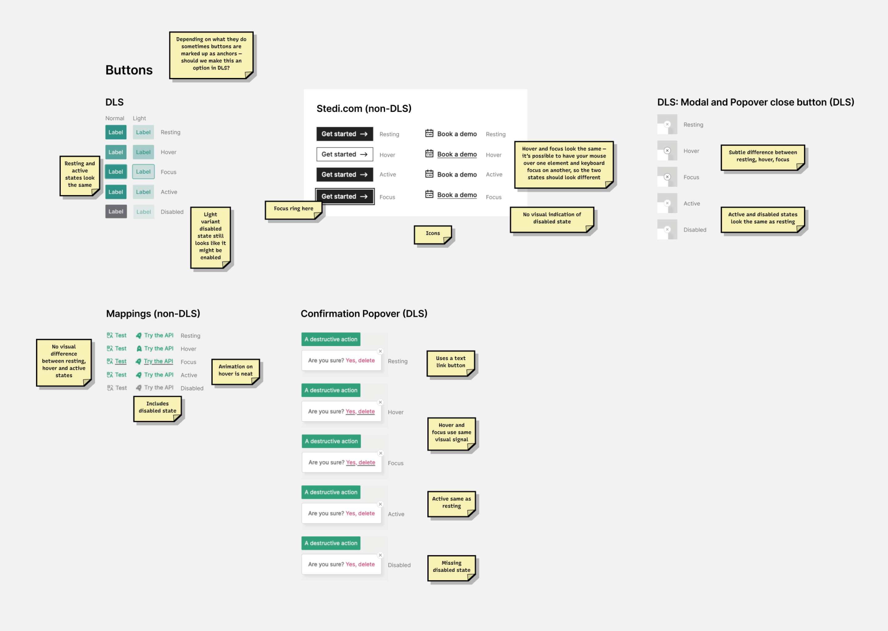
With the foundational UI components and tokens in place, I moved on to more components, including popovers, drop-down menus, and modals. Each time I followed the same process of an initial audit, designing a new component that would work for our use case, writing it and shipping it to product teams with documentation. Each time we improved the cohesion, usability, and accessibility of Stedi’s products, and each time we reduced the maintenance overhead of multiple teams’ user interfaces.
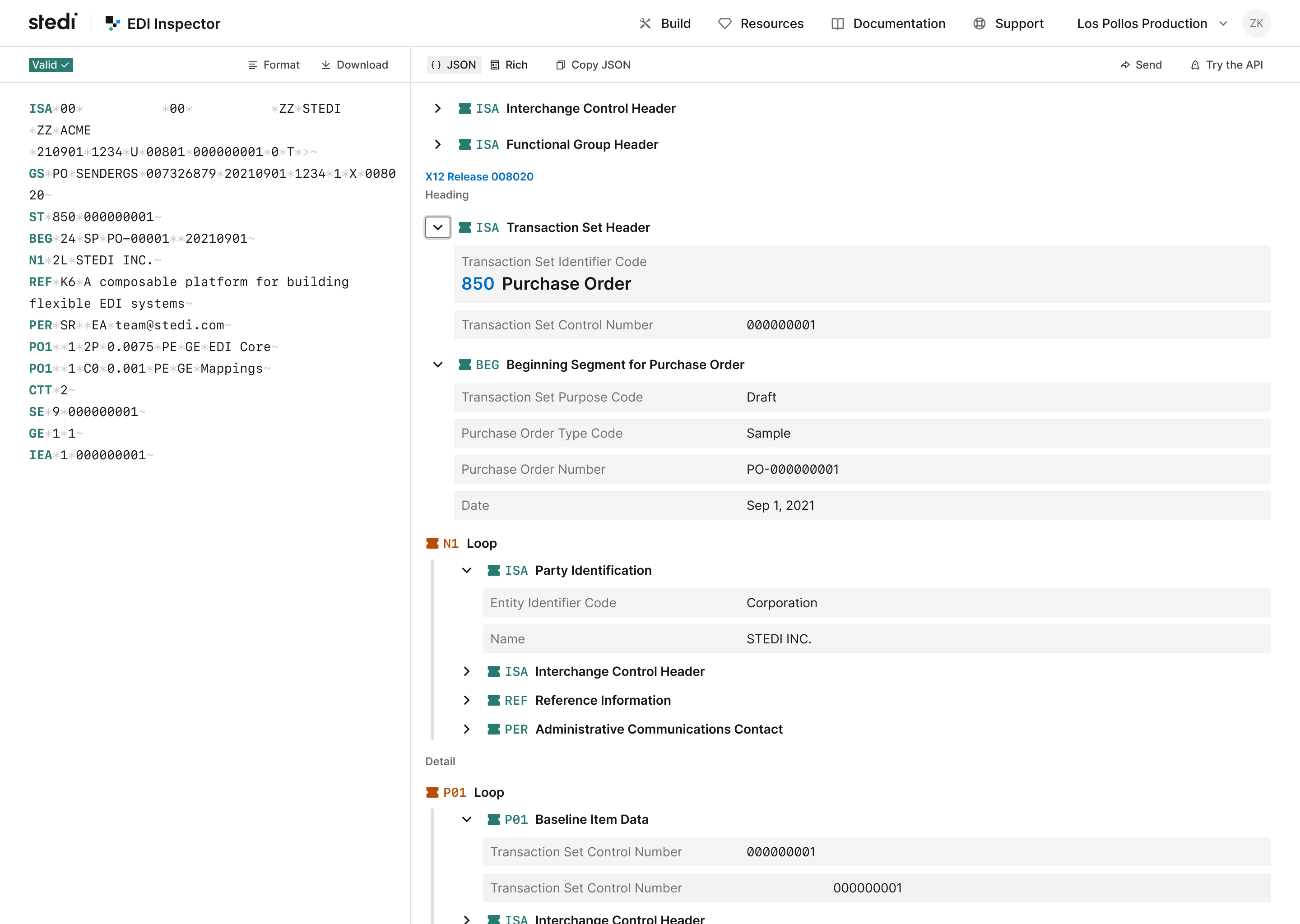
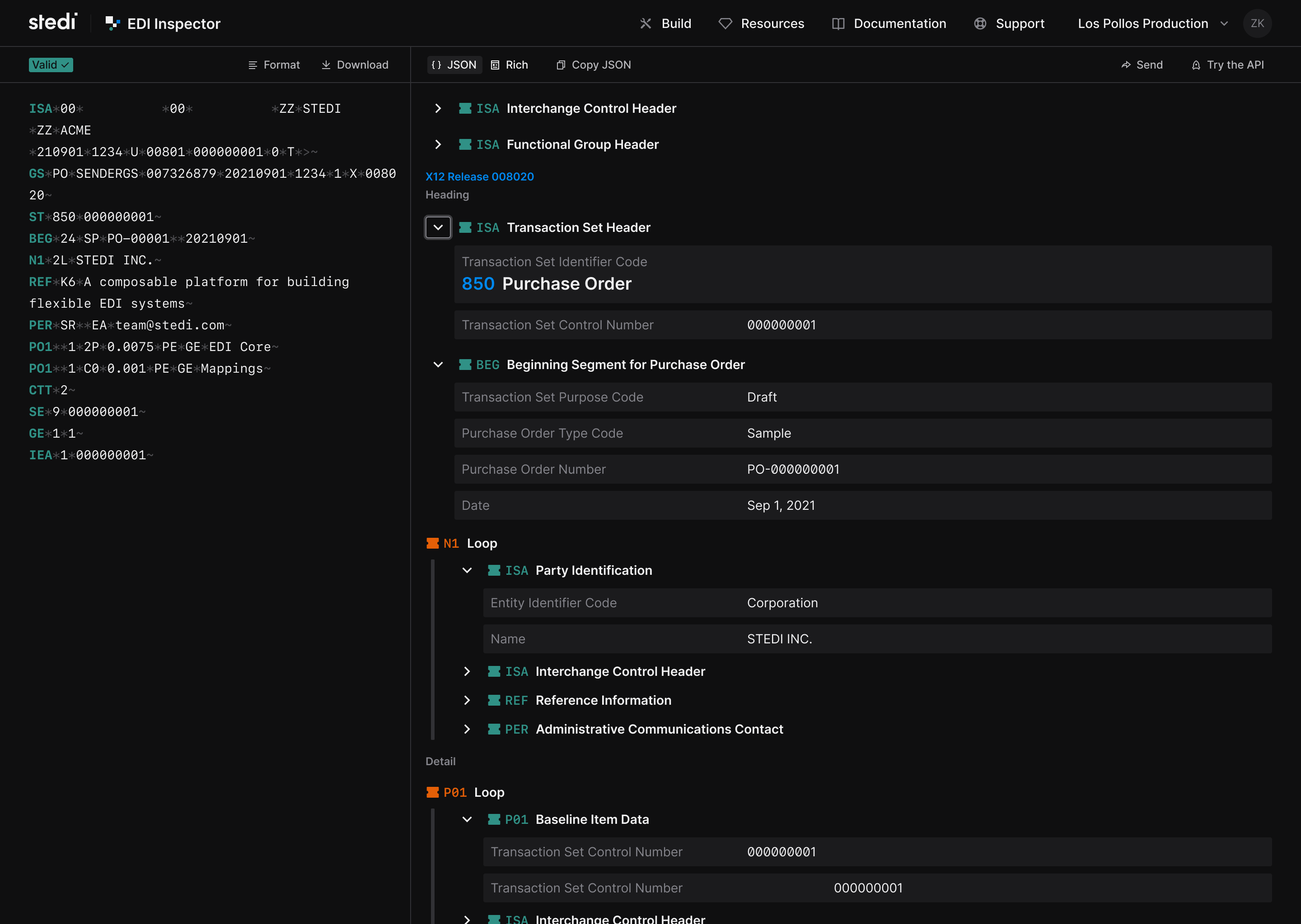
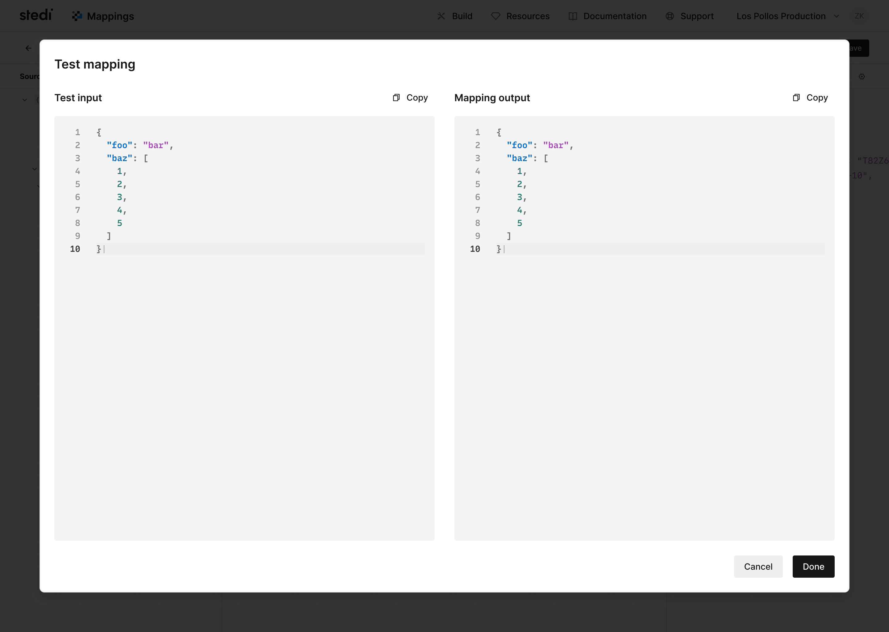
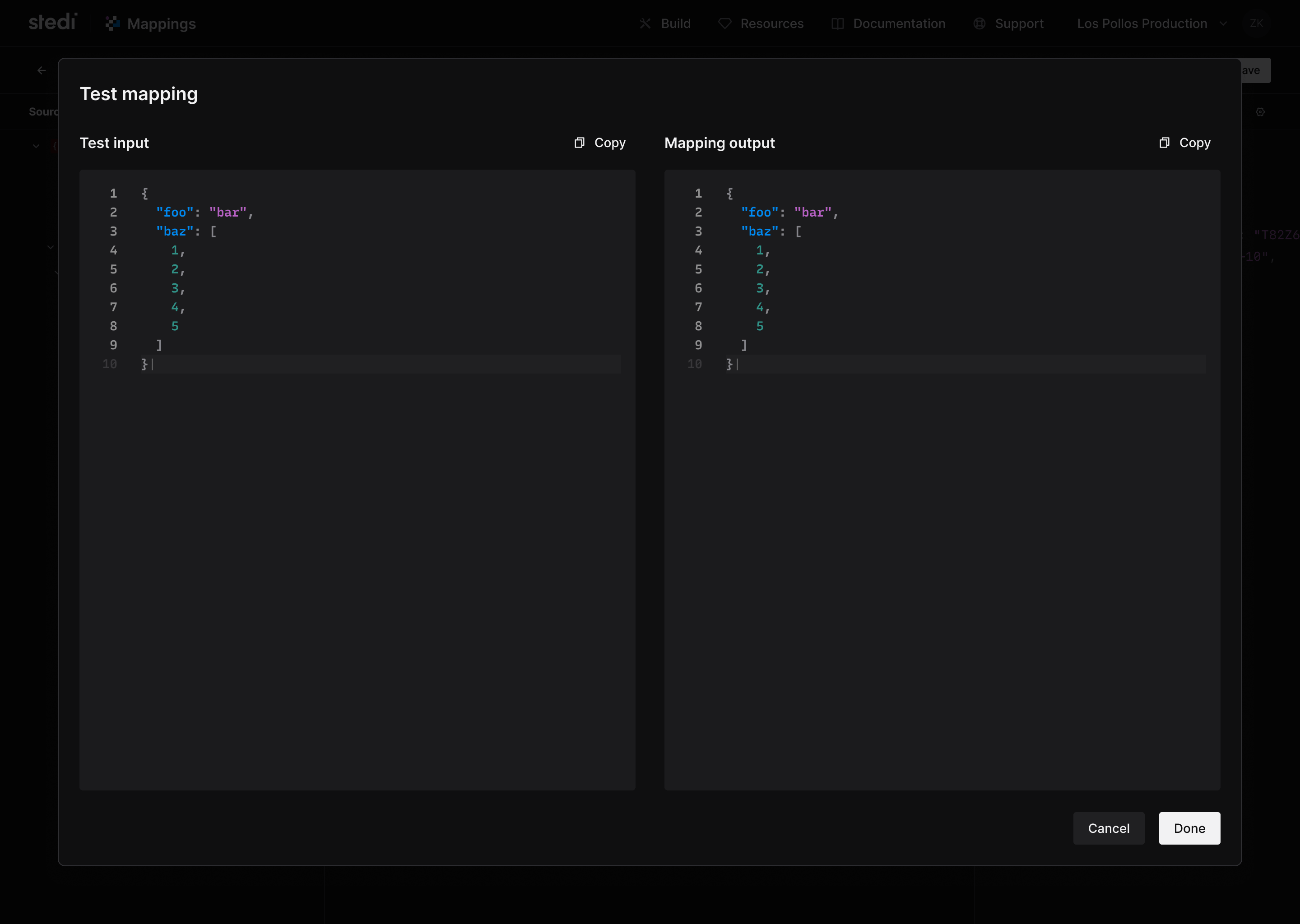
Here are a few screen grabs illustrating experiments and thinking during the design system project.
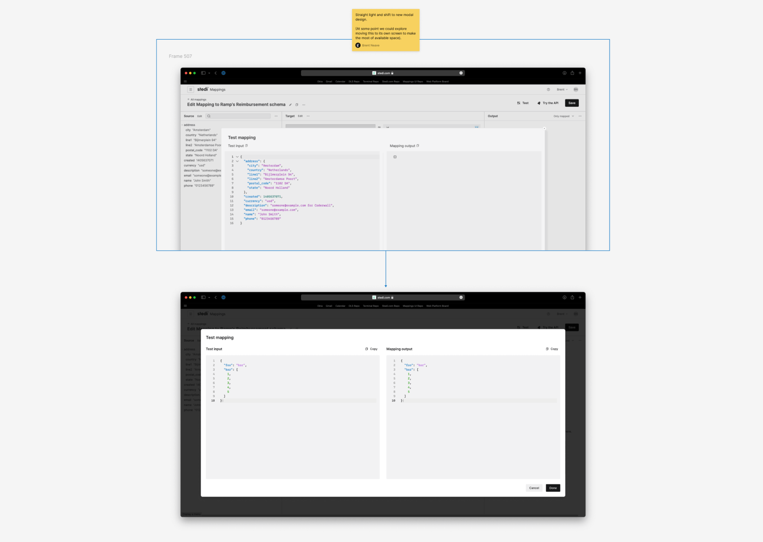
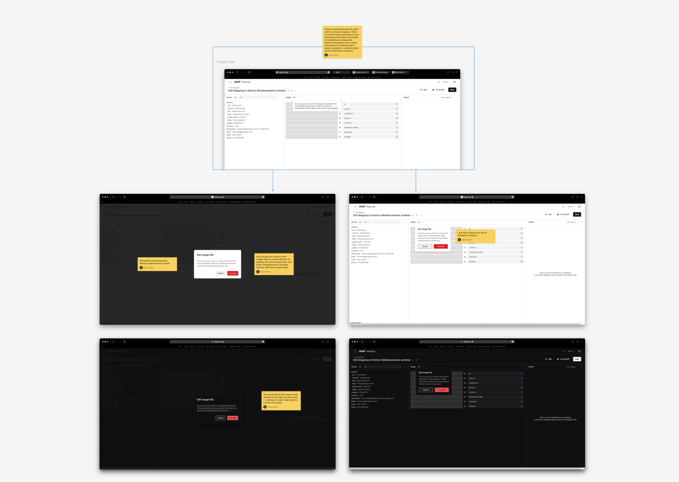
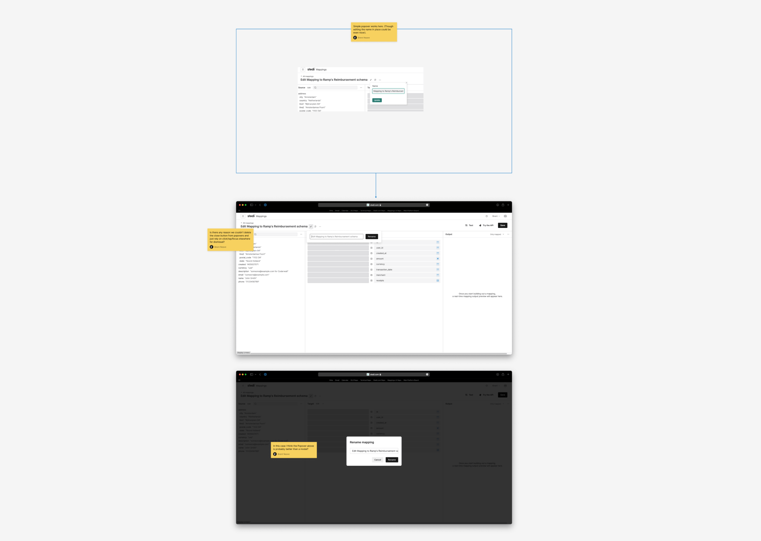
Modal and Popover components.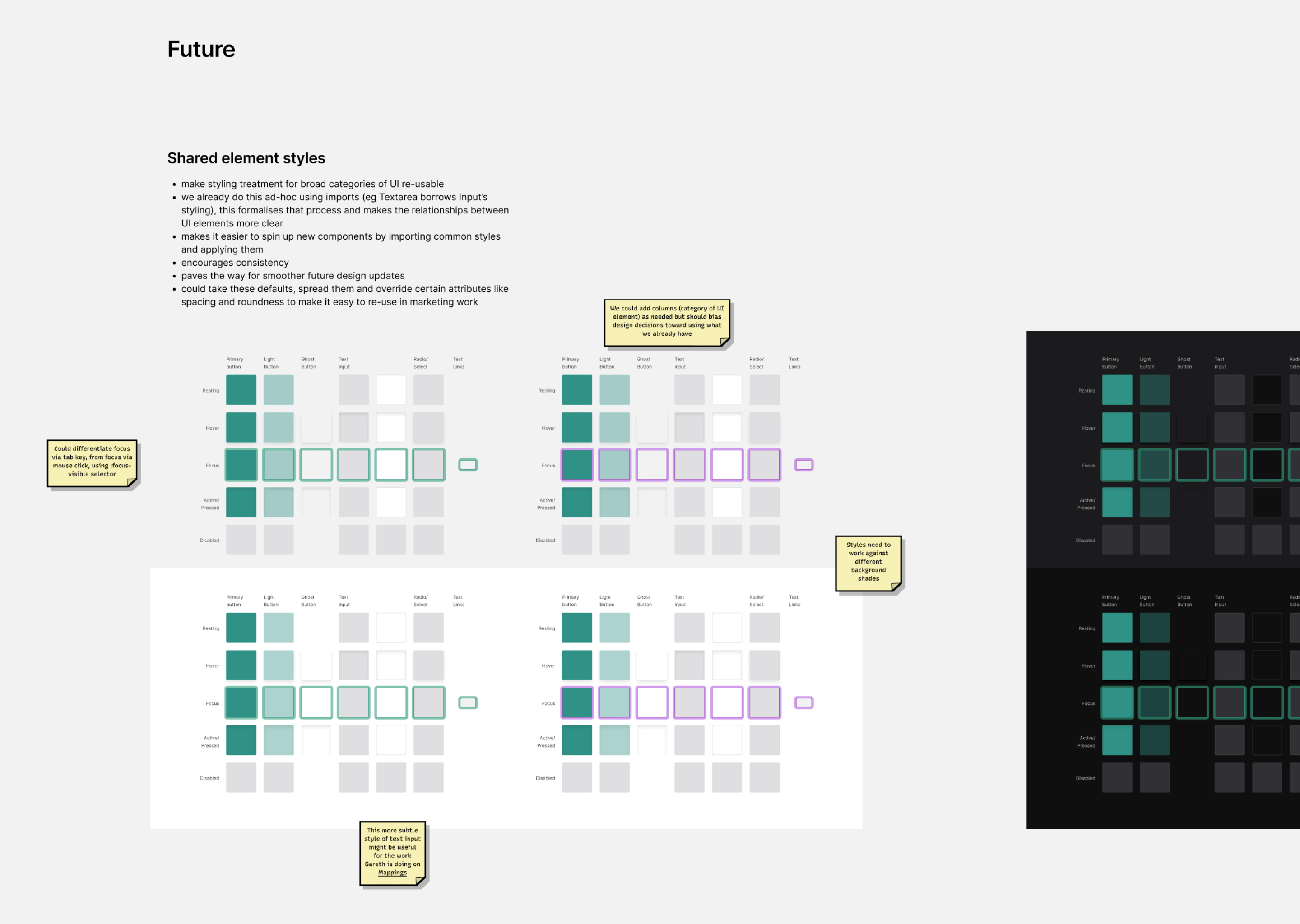
This hybrid role was not only an opportunity to plan, architect and design elements of a design system, but also to build and integrate them into all of Stedi’s products. I made a lot of pull requests refactoring production codebases to take advantage of design system updates. During that process it was immensely rewarding to meet and talk to other Stedi employees around the globe, and I learned a great deal from them.
Many of the lessons about design systems from BNZ were adaptable in some way to the context of a smaller organisation at Stedi. For a design system to succeed, whether you have four teams or twenty, you ought to focus on building relationships and making the design system the easiest way for designers and developers at the company to create effective, usable and accessible user interfaces. It’s my hope that our team accomplished that at Stedi.
Consistently high interface design standards organisation-wide: I collaborated with design, business, and technical people to evolve and improve the organisation-wide design language and roll it out in a way that made it simple for everybody to incorporate it into their work during the entire design and development process.
Reduced maintenance overhead: we greatly reduced the surface area of user interfaces and front end code across the organisation by consolidating duplicated effort across multiple projects into a single, robust dependency. Almost every time we merged a design system update into a consuming team’s codebase, there were more removals than additions in the diff.
Improved efficiency: Implementing the design system in a Figma library and maintaining parity with production code helped designers and developers work efficiently together. Design tokens, a comprehensive colour palette, and a comprehensive suite of components eliminated a lot of decision making overhead and repetitive work from new features, freeing everybody up to focus on the bigger picture.
Improved usability and accessibility: Each design system component implemented the same, standard affordances for interactivity, supported multiple input methods, and met WCAG standards for accessibility. That made the product more accessible and easier to use for everyone.